Creative Director and Senior Visual Designer with expertise in luxury branding and exhibition design. Let’s collaborate—get in touch to discuss your project or learn more about my process. ↓
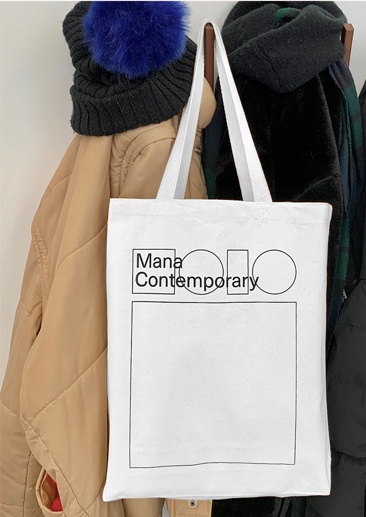
Mana Contemporary – Visual Identity
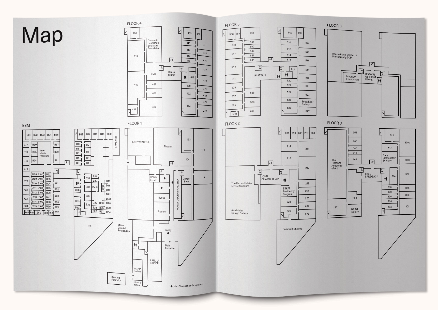
Mana Contemporary is an expansive arts and cultural center featuring contemporary
visual and performing arts programming and exhibitions, located in Jersey City, Chicago, and Miami.
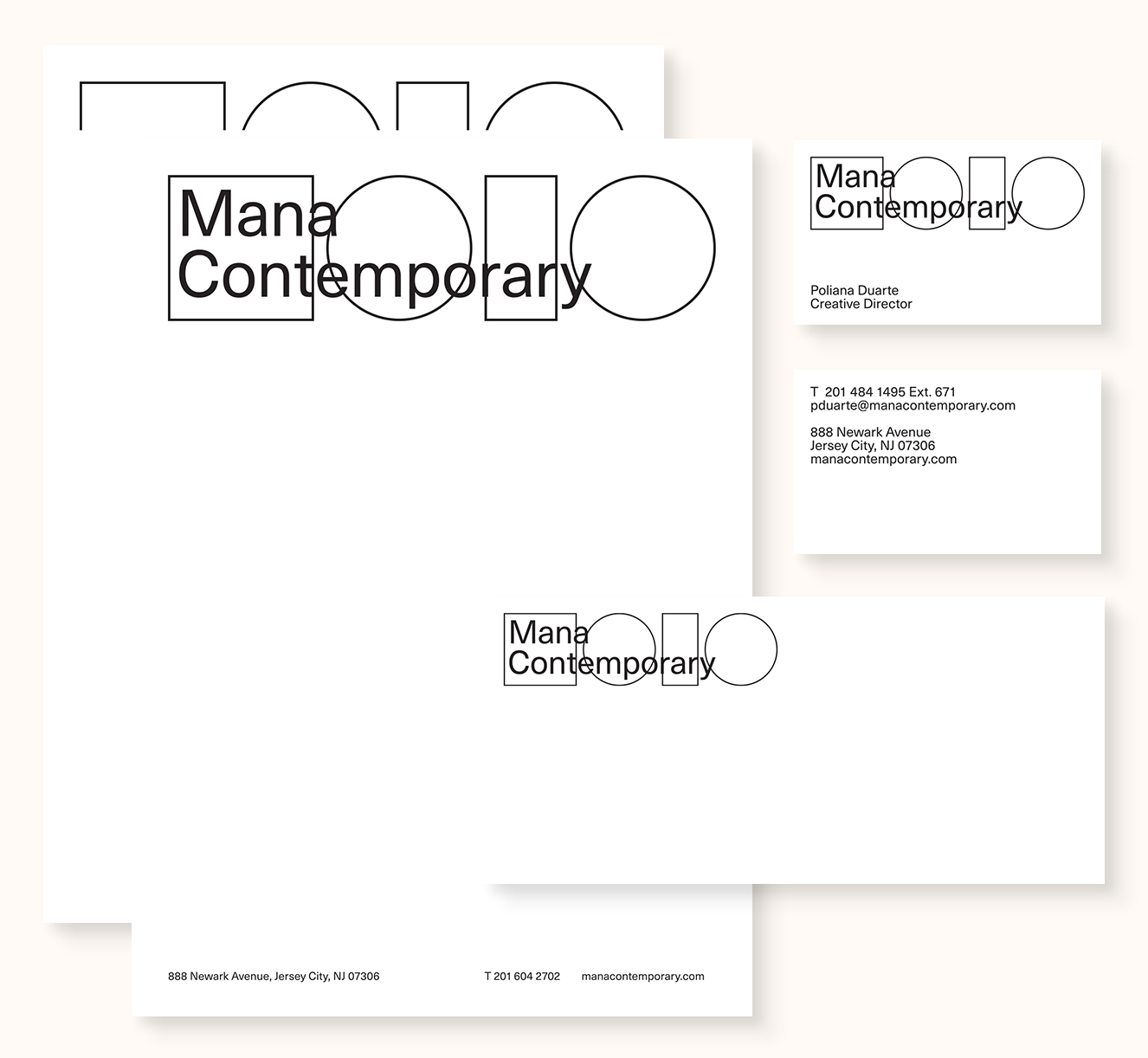
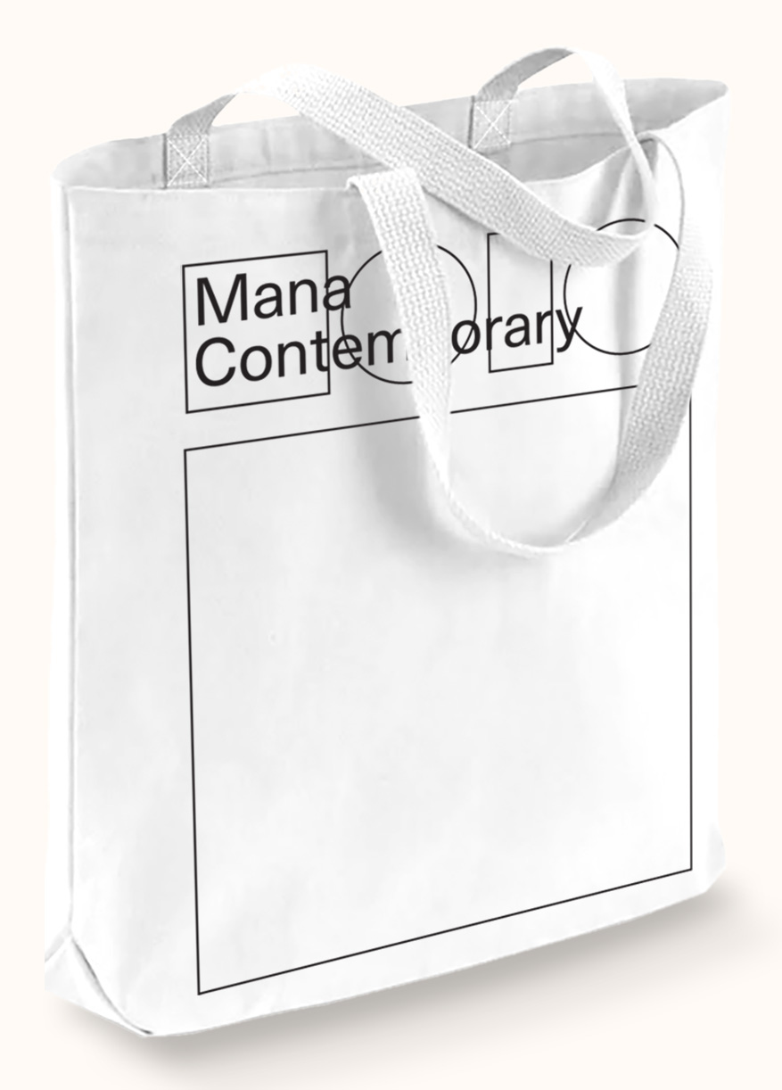
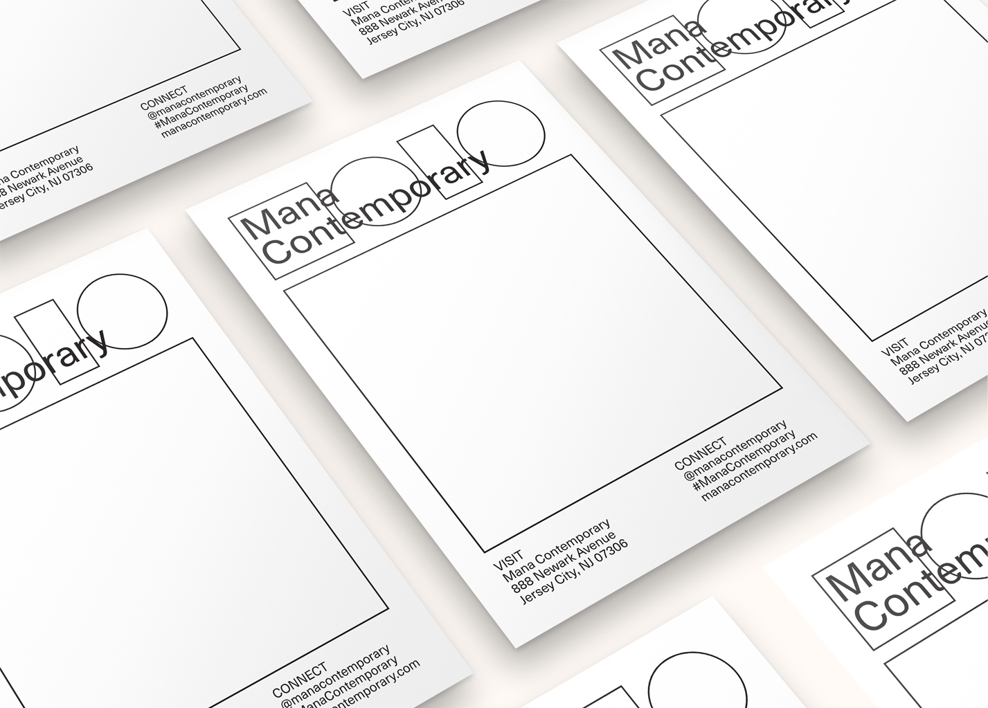
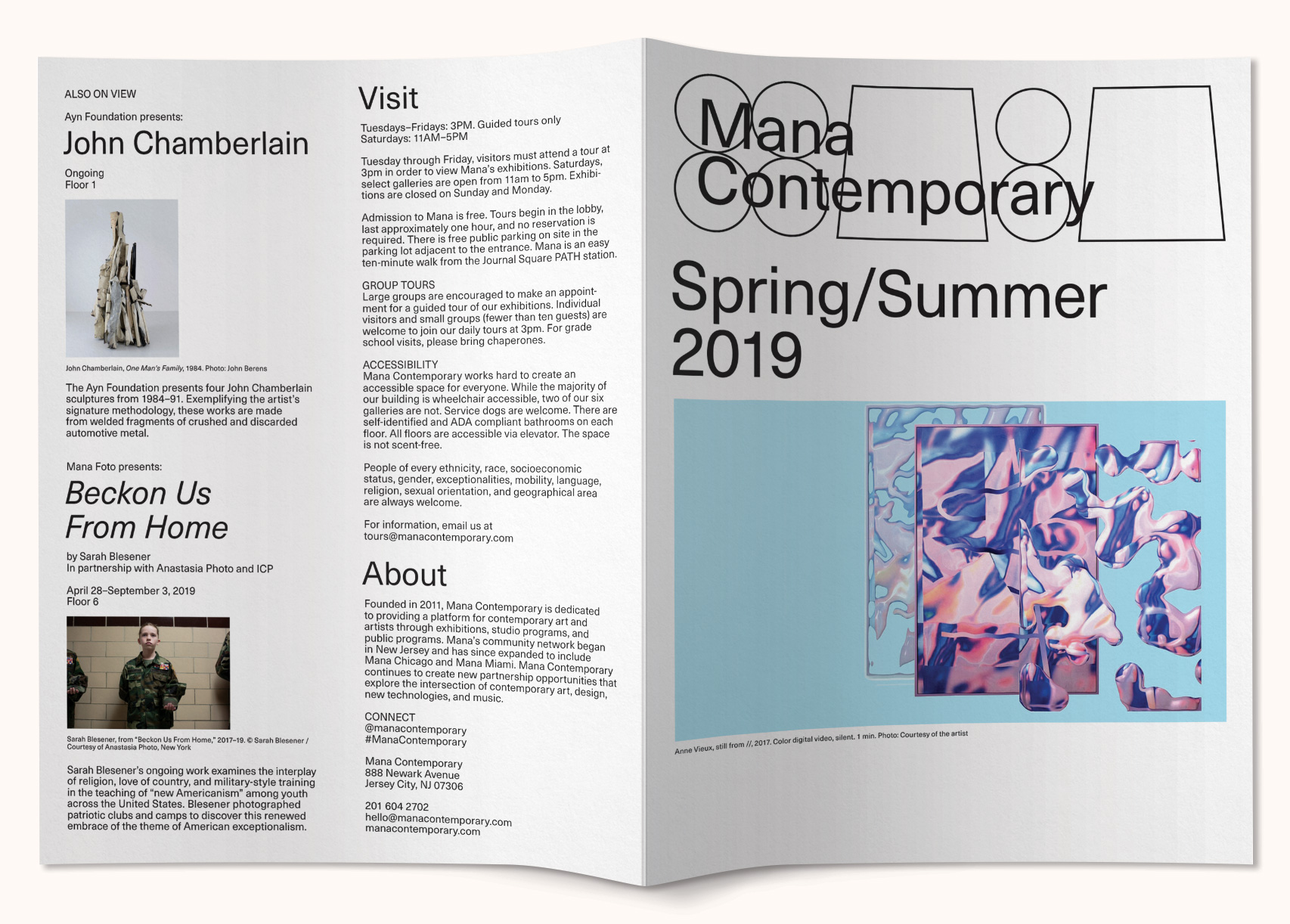
As the former Head of Design and Creative Director at Mana Contemporary, I collaborated with a team to rebrand the cultural center. We aimed to celebrate the diversity of each building, using shapes and symbols inspired by their past lives. The Jersey City flagship, for example, received shapes resembling cigarettes and gold cubes, referencing its history as an Old Gold cigarette manufacturing plant. The logo representing all locations is based on the most basic geometric forms, creating a cohesive branding system that honors the collective histories and their diverse arts communities. Collaborated with Yeliz Secerli, Immanuel Yang, and Yujin Lee
manacontemporary.com
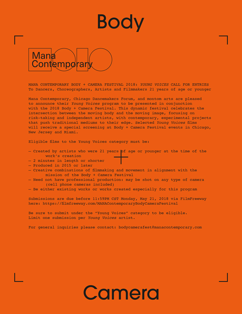
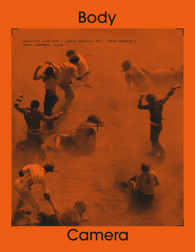
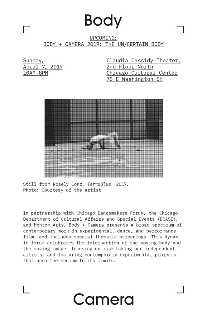
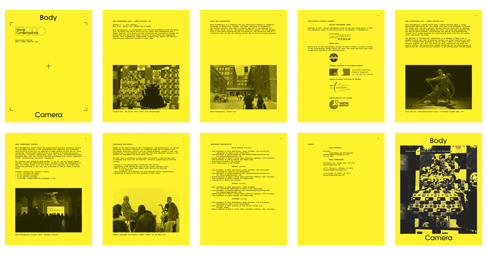
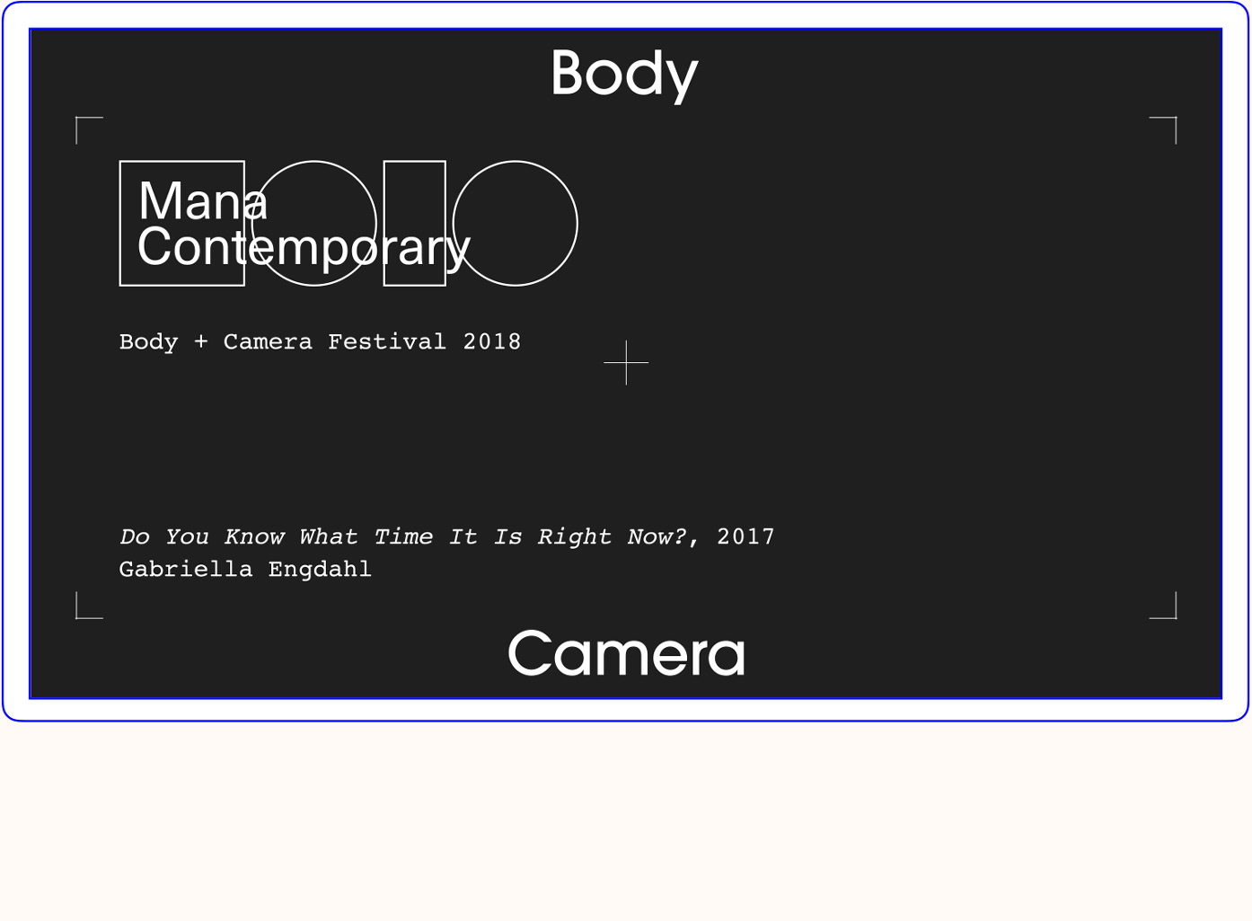
Body + Camera Festival
This festival featured over 40 short films by emerging and established
artists from around the world, exploring the intersection between the body and the moving image.
In an effort to honor the long tradition of dance and film, we aimed to embody the spirit of an old school, nostalgic look, while harnessing a contemporary feel. Symbols and graphics of a traditional viewfinder were arranged on top of images in motion, effectively closing in on the artistic targets of interest. This effect spotlights the creativity from both the dance and film worlds. Thanks to graphic designer Immanuel Young for bringing this vision to life.
In an effort to honor the long tradition of dance and film, we aimed to embody the spirit of an old school, nostalgic look, while harnessing a contemporary feel. Symbols and graphics of a traditional viewfinder were arranged on top of images in motion, effectively closing in on the artistic targets of interest. This effect spotlights the creativity from both the dance and film worlds. Thanks to graphic designer Immanuel Young for bringing this vision to life.
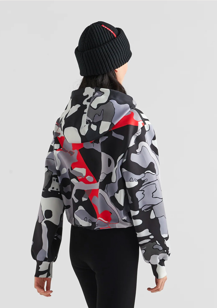
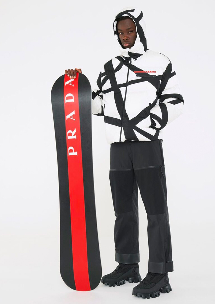
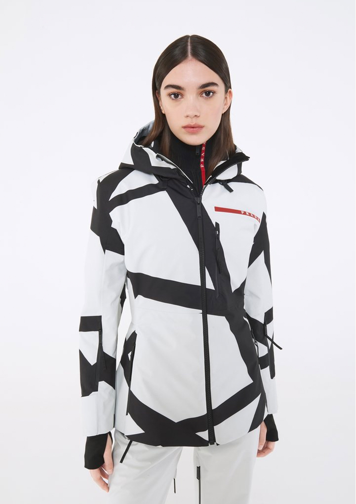
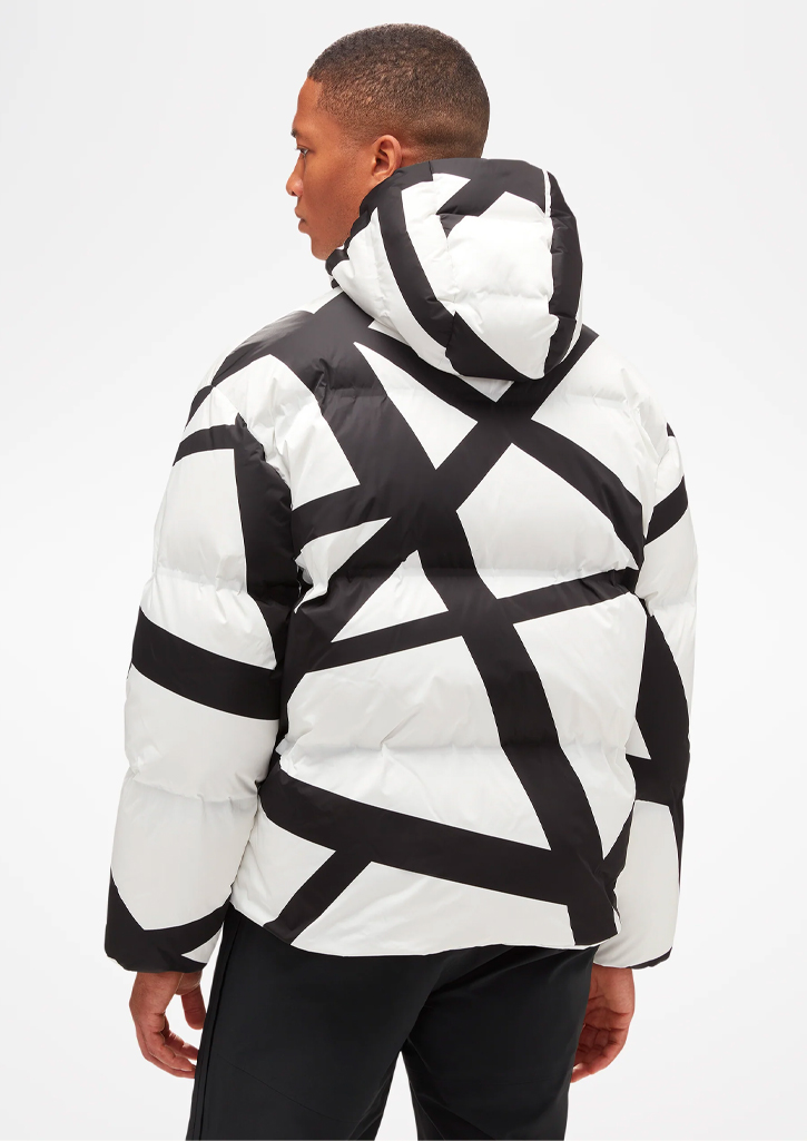
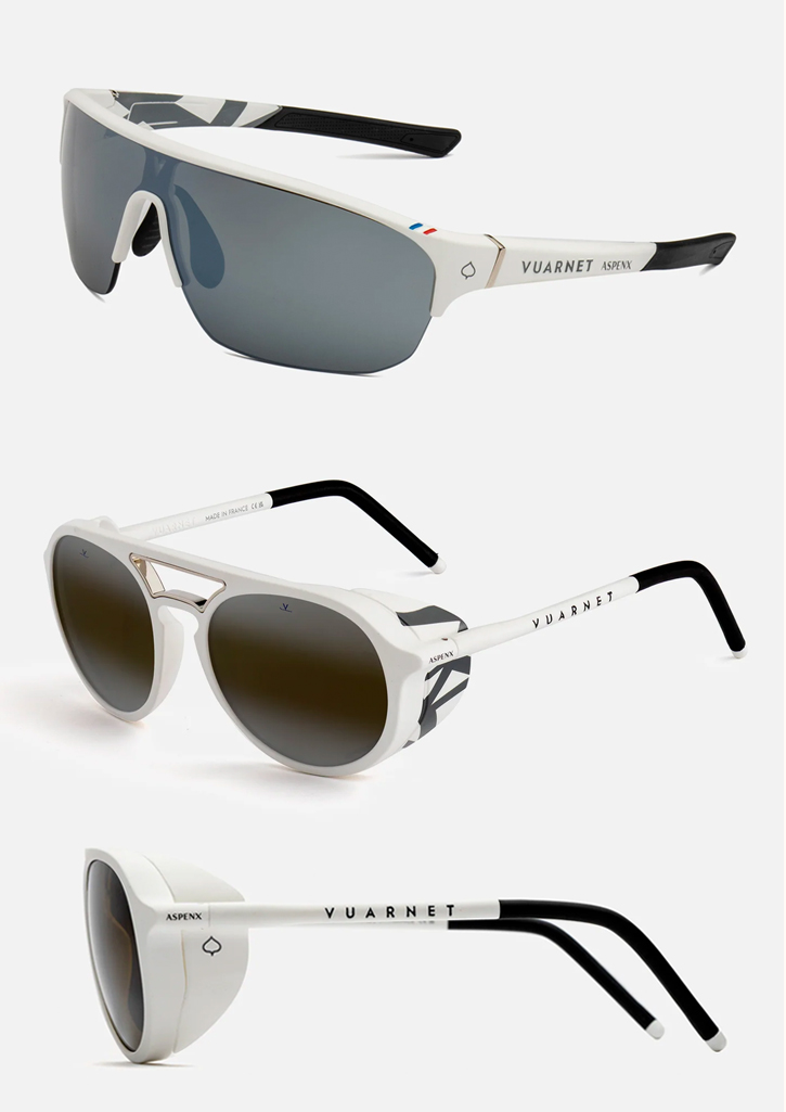
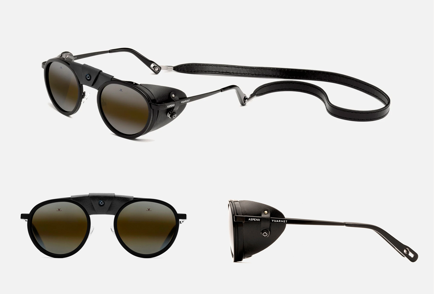
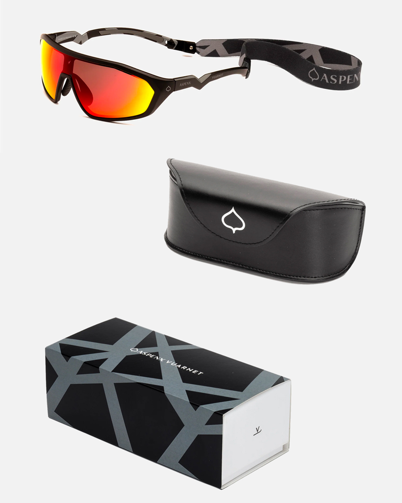
ASPENX – Prada and Vuarnet
Premium retail and experiential brand, Aspen Skiing Company,
partnered with luxury companies, Prada, Vuarnet, and Anon for an inspiring take on ski wear,
led by contemporary artist and founder, Paula Crown.
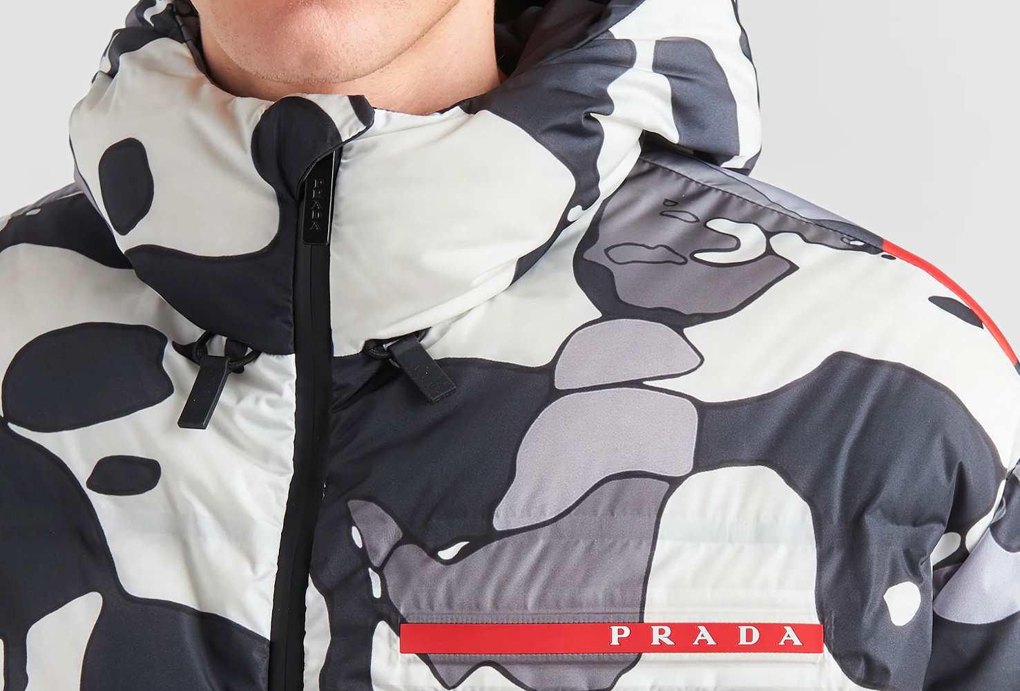
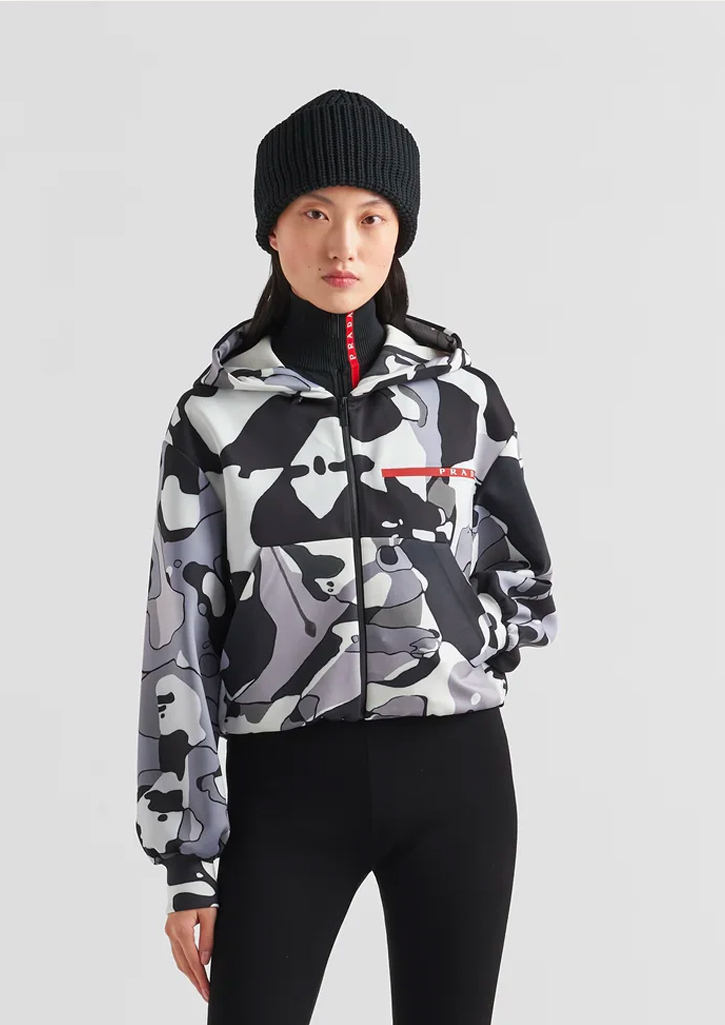
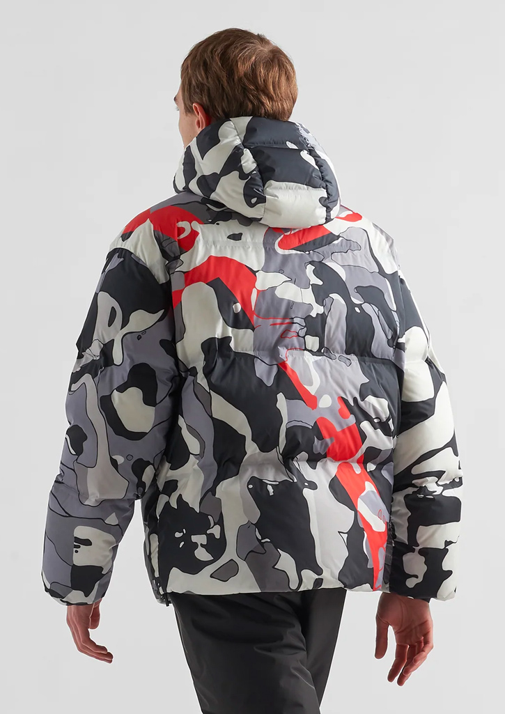
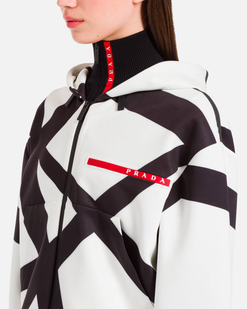
For the past three seasons, I worked closely with Ms. Crown and the ASPENX team to conceptualize prints, graphics and branded assets for high-end products that blend art, fashion, and outdoor recreation. The result was fresh and inspiring yet still approachable.
aspenx.com
For the past three seasons, I worked closely with Ms. Crown and the ASPENX team to conceptualize prints, graphics and branded assets for high-end products that blend art, fashion, and outdoor recreation. The result was fresh and inspiring yet still approachable.
aspenx.com
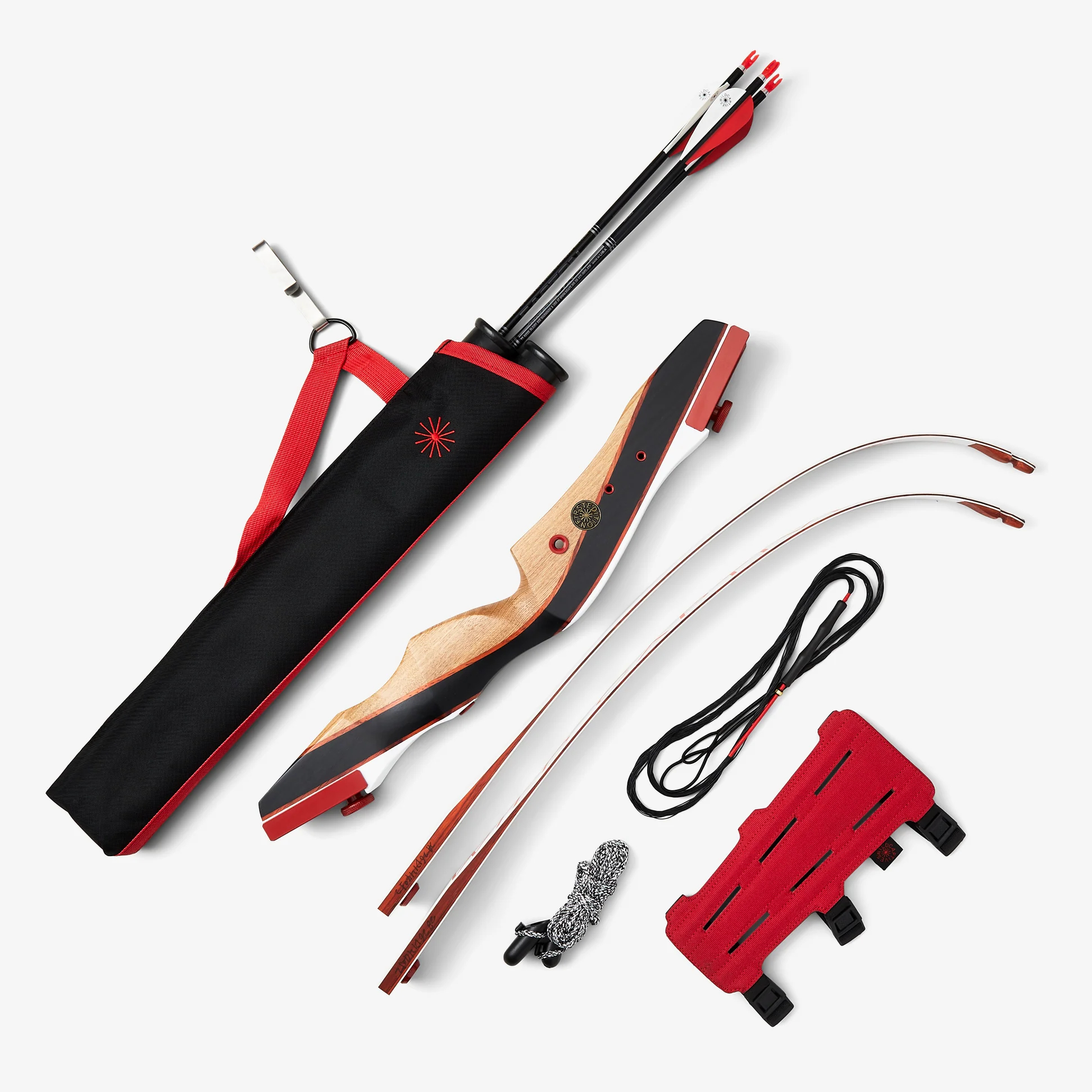
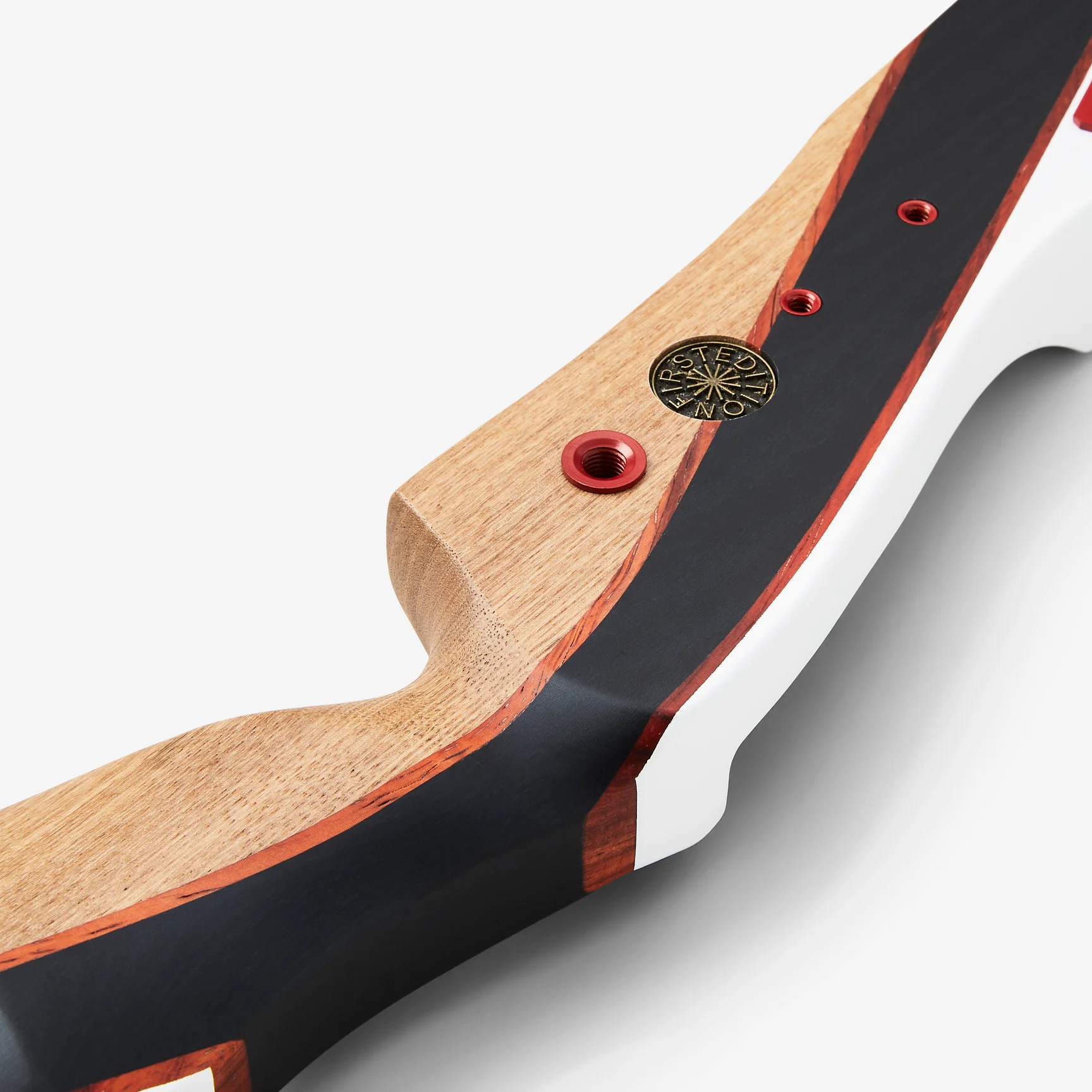
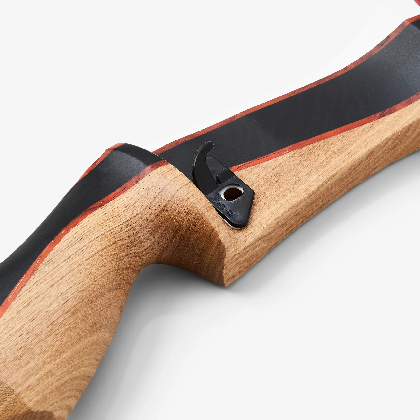
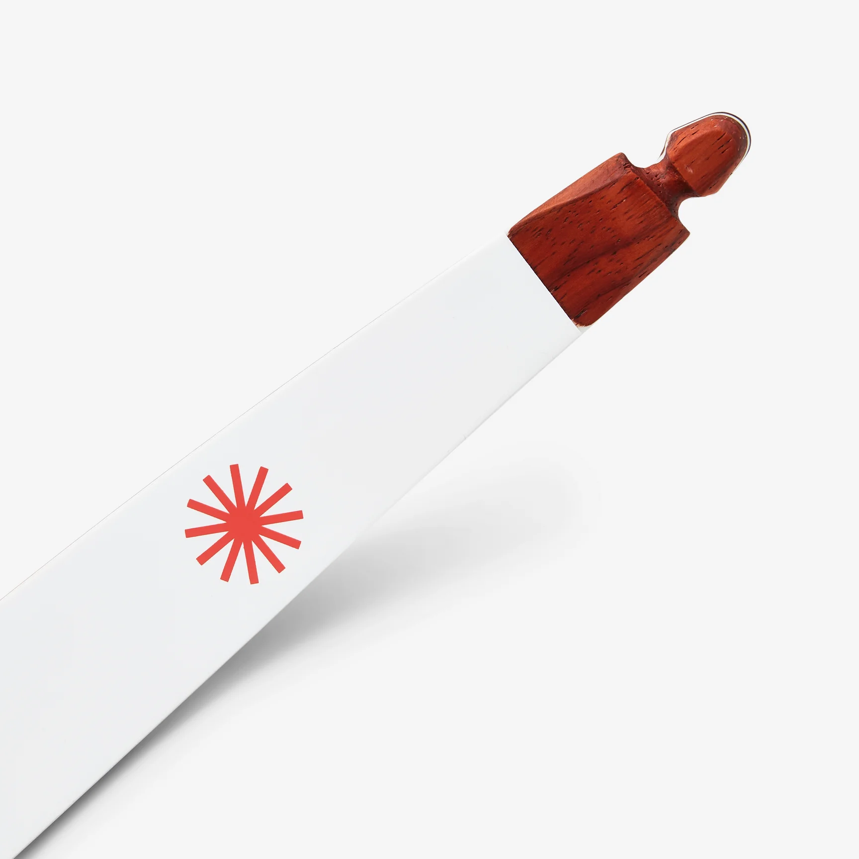
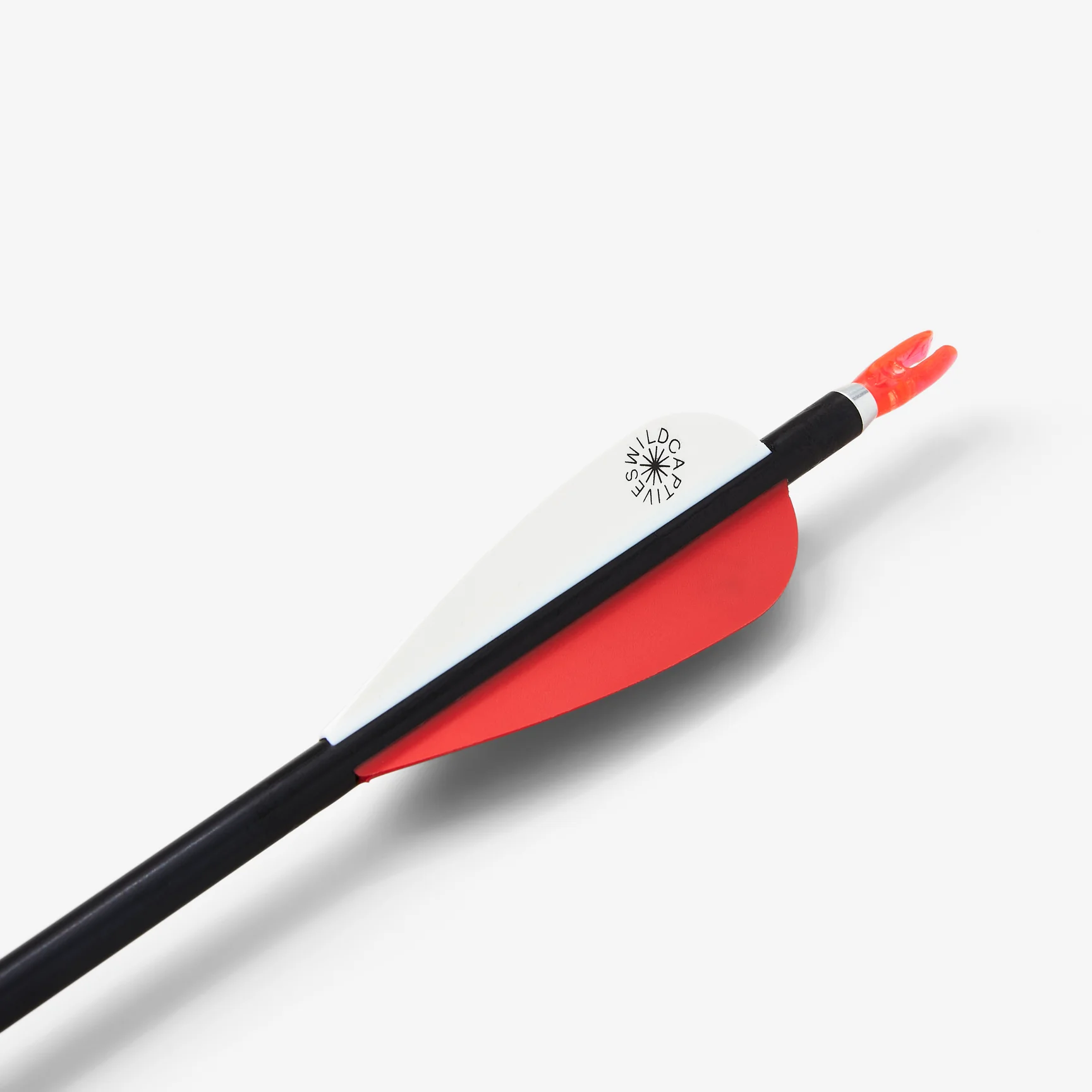
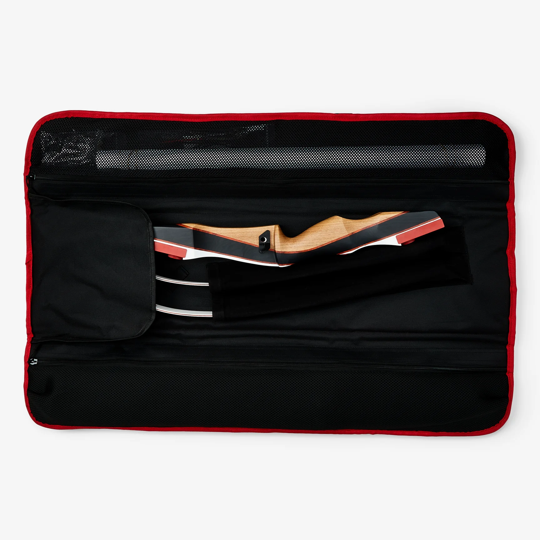
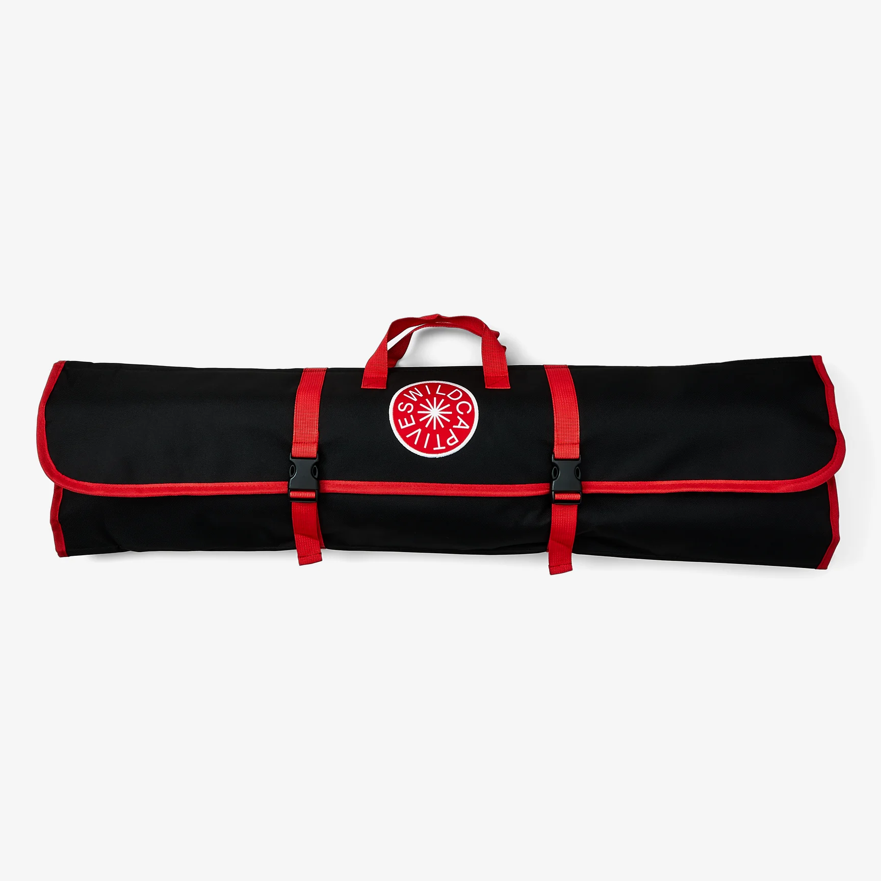
The Wild Captives Archery Kit – Product Design
Wild Captives is an urban outdoor sporting venture that encourages individuals to step away from their screens and immerse themselves in hands-on skills.
As the graphic and product designer of The Wild Captives Archery Kit, I collaborated closely with the company's founder, an avid archer, and a team of archery production professionals. Together, we crafted a product that encapsulates the essence of archery's rich heritage while addressing the contemporary needs of urban adventurers. At its core lies the Wild Captives Recurve Bow, distinguished by its sleek all-white minimalist façade that boldly departs from conventional camouflage patterns, instantly capturing attention. Meticulously selected materials, including a robust solid wood riser, culminate in a fusion of durability and aesthetic allure. Designed to cater to both novices and intermediate archers, this design deeply resonates with its diverse audience, inviting them to embark on micro-adventures within the urban landscape.
wildcaptives.com

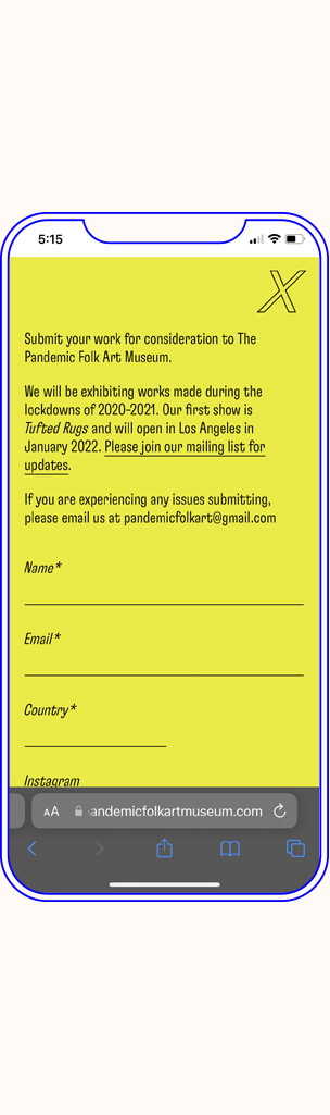
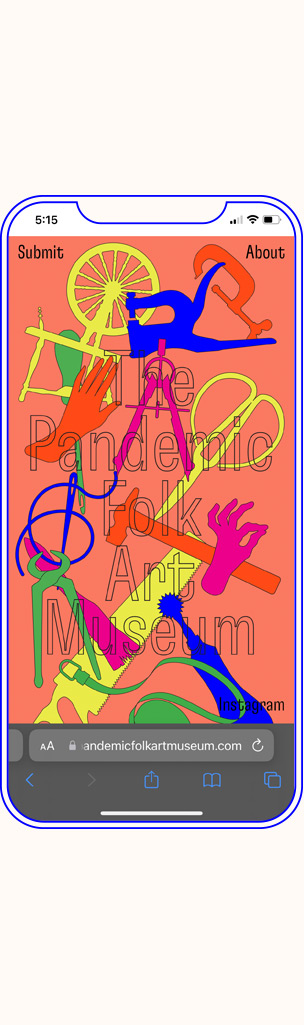
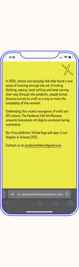
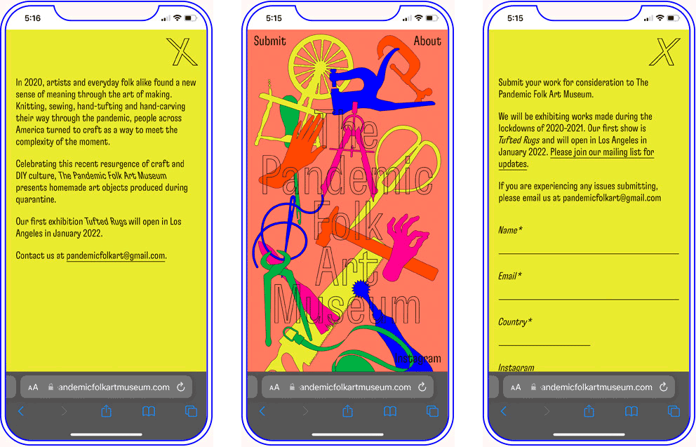
The Pandemic Folk Art Museum
As people across America turned to craft as a
way to meet the complexity of the moment, this pop-up museum was created to present the homemade art objects
produced during quarantine.
Wanting to celebrate the resurgence of craft and DIY culture that emerged during the pandemic, we worked to develop a visual identity that lightened the entire pandemic mood. The brightly colored shapes and silhouettes of tools introduces a playful representation of crafting possibilities, producing an effect that is both sentimental and modern. Designed in collaboration with Yeliz Secerli.
pandemicfolkartmuseum.com
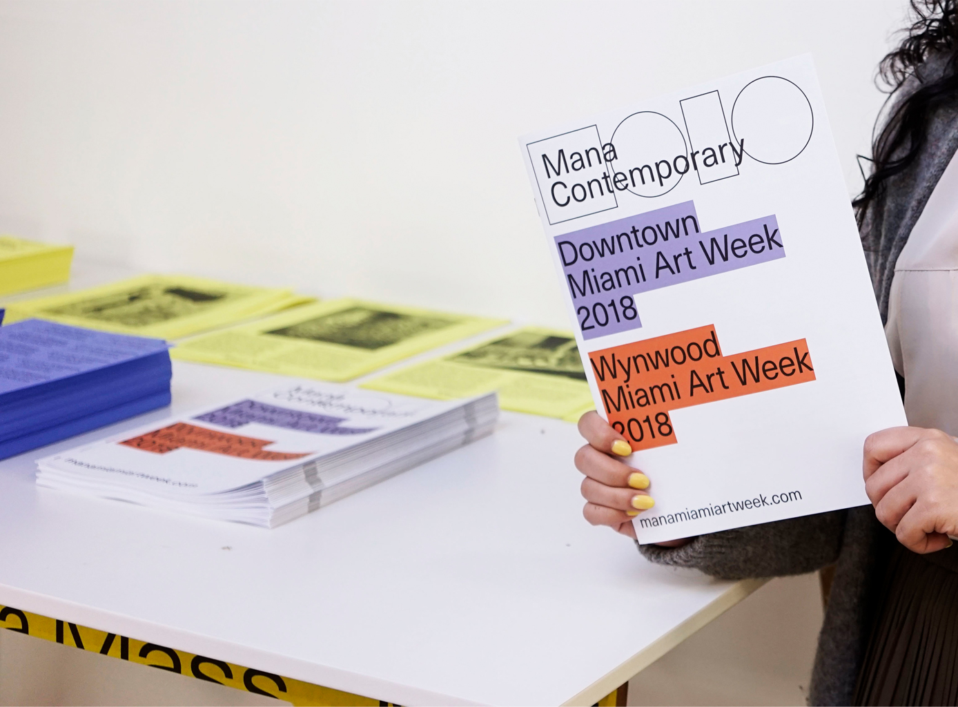
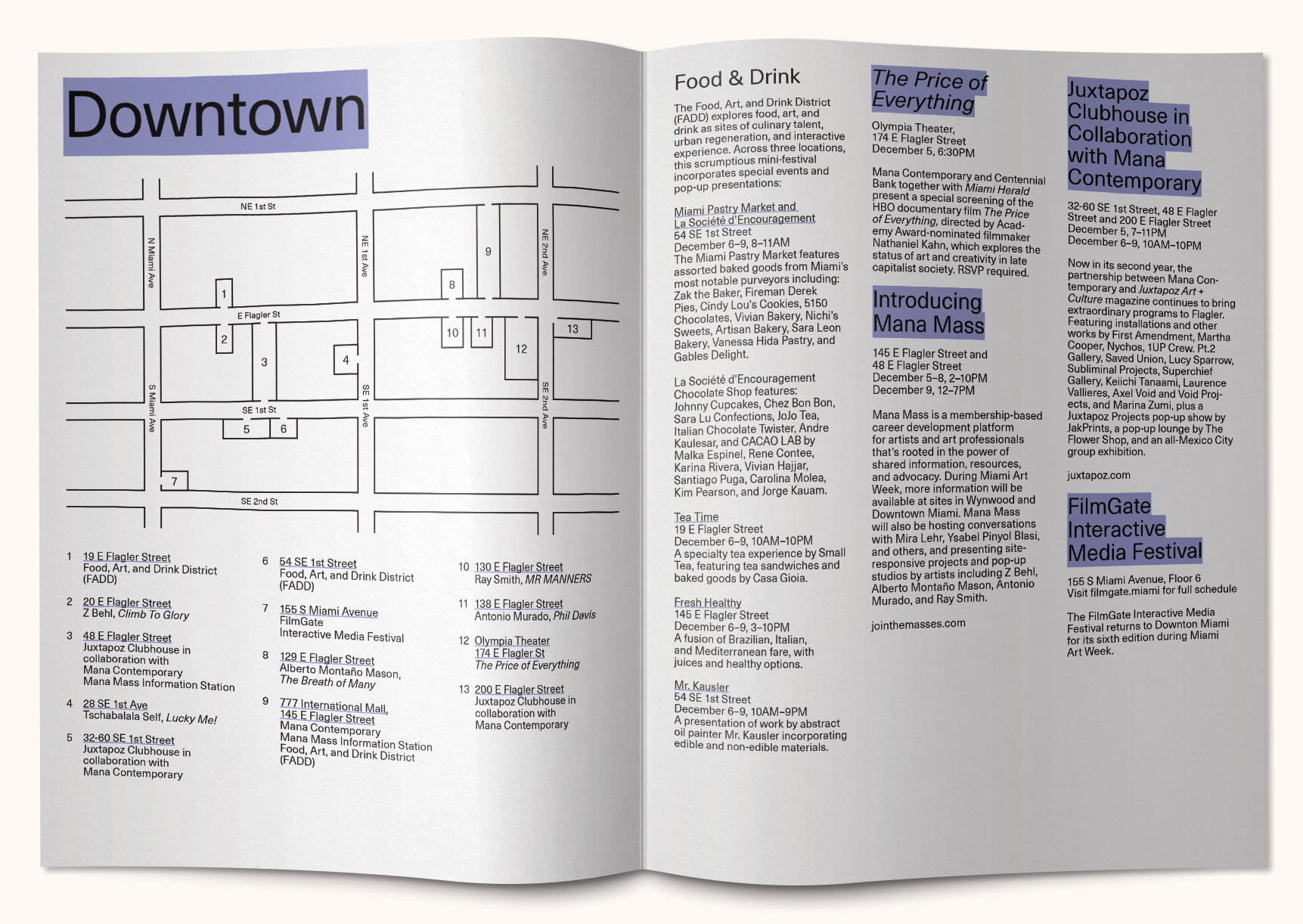
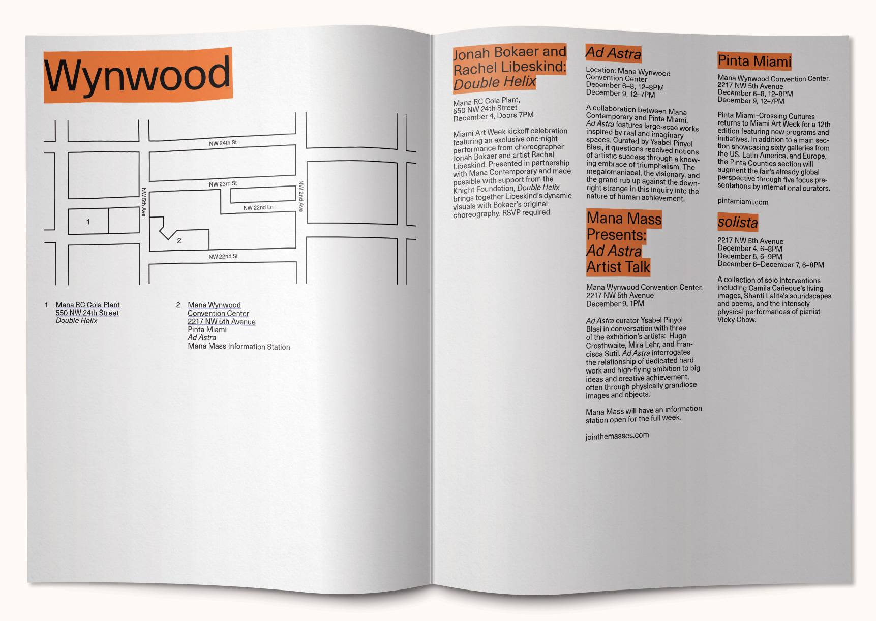
Mana Contemporary – Miami Art Week 2018
Mana Contemporary curated annual exhibitions and programs
during Miami Art Week that took place around various locations in Wynwood and Downtown Miami.
My team conceptualized, conceived, and produced all of the graphics and promotional assets for the program, including the one sampled here. While maintaining the essence of the cultural center's brand, we worked collaboratively to create a visually striking and engaging design that would appeal to the art community and draw attention to the various exhibitions and programs that were taking place throughout the week.
My team conceptualized, conceived, and produced all of the graphics and promotional assets for the program, including the one sampled here. While maintaining the essence of the cultural center's brand, we worked collaboratively to create a visually striking and engaging design that would appeal to the art community and draw attention to the various exhibitions and programs that were taking place throughout the week.
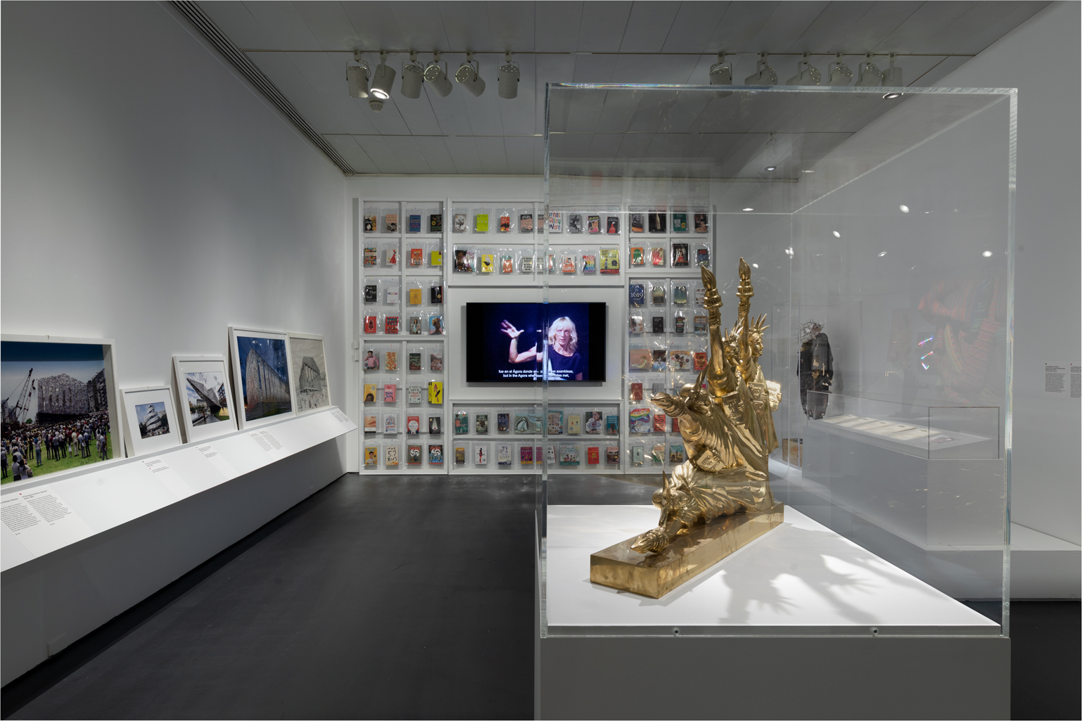
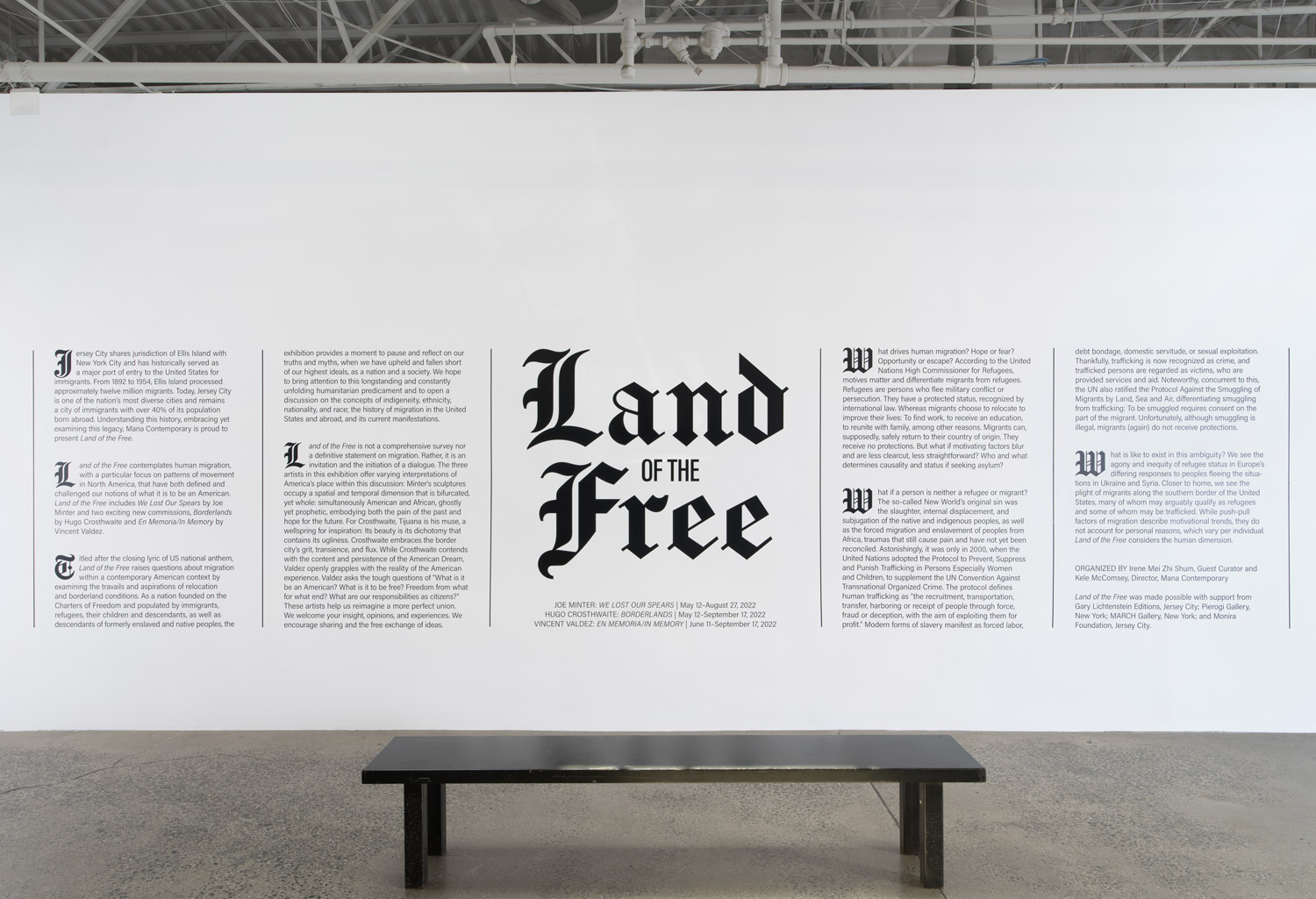
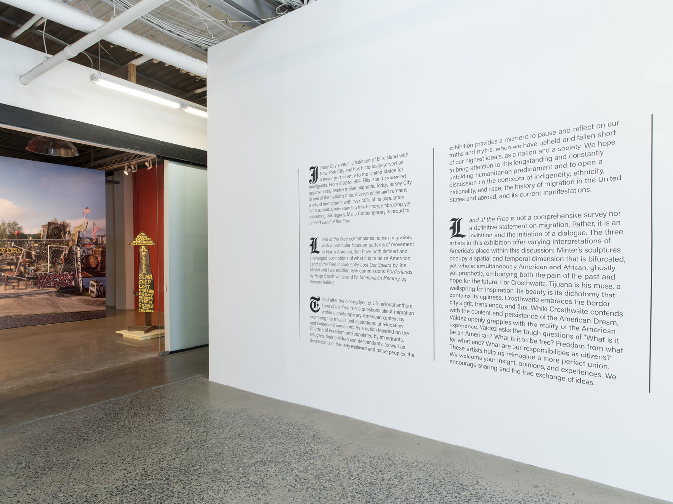
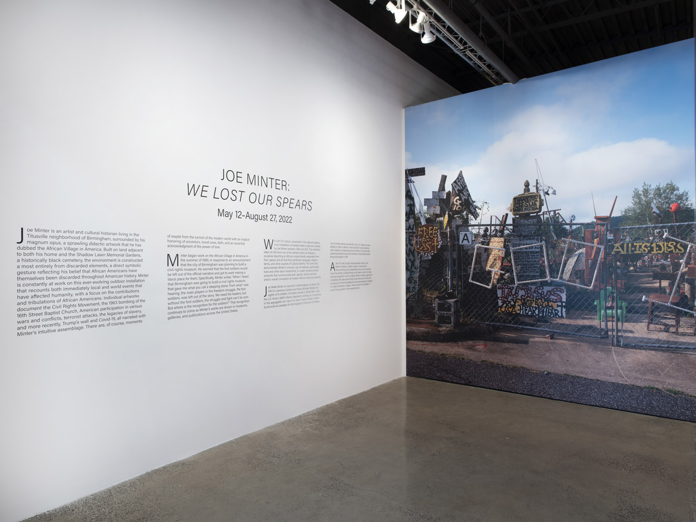
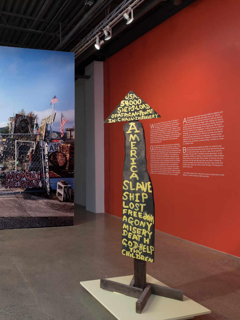
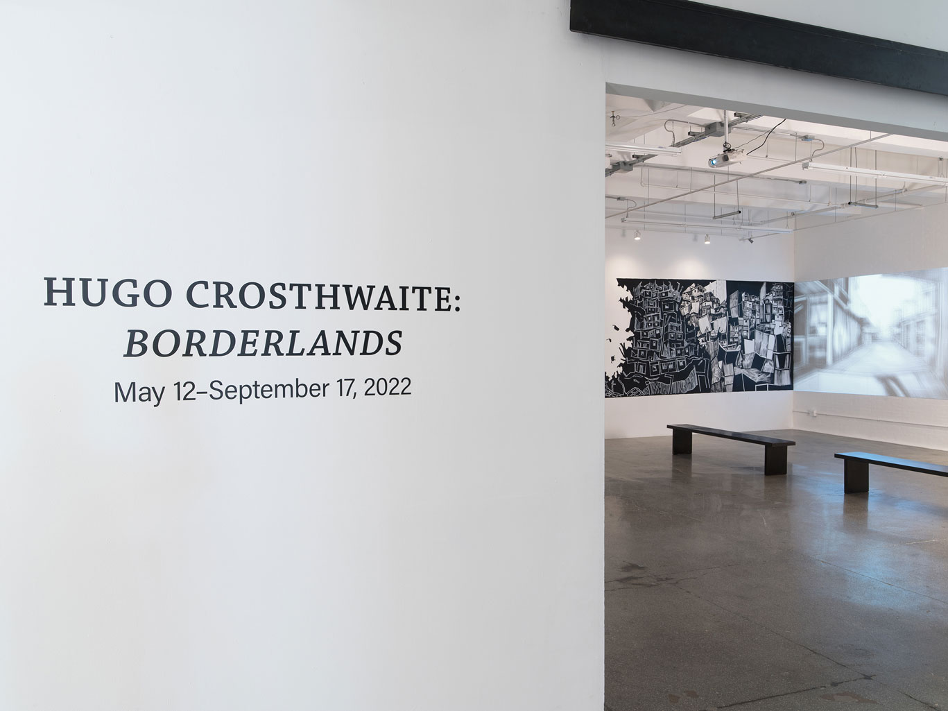
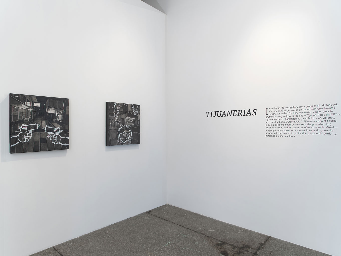
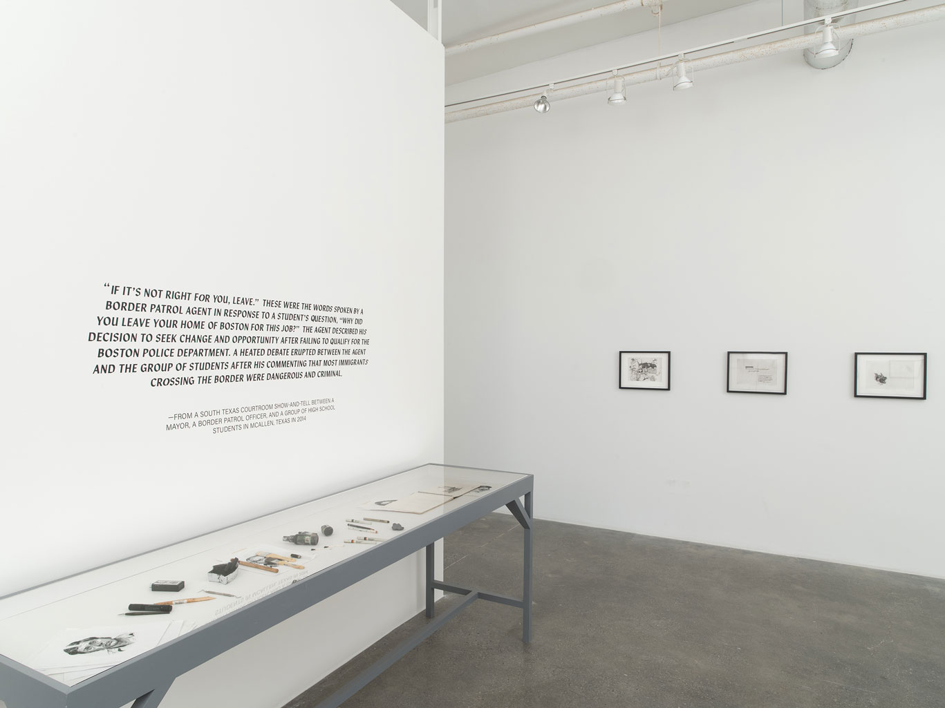
Land of the Free – Exhibition Visual Identity
Three thematically related solo exhibitions contemplate
human migration and challenge our beliefs of what it is to be an American.
The visual identity for the exhibition Land of the Free at Mana Contemporary was carefully crafted to evoke a sense of history and timelessness. With a nod to old newspaper and history books’ layout design, the branding alludes to the longstanding and ongoing issues of human migration. Each exhibition within Land of the Free was given its own distinct identity, while still being recognizable as part of the larger brand. This allowed for the unique voices of Joe Minter, Hugo Crosthwaite, and Vincent Valdez to be highlighted in their respective areas, while the overall visual identity served as a unifying element.
Photos by John Berens
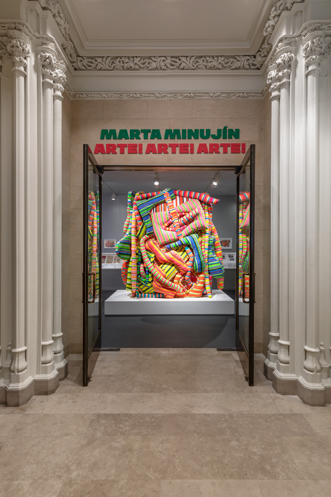
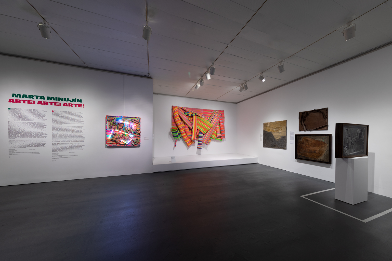
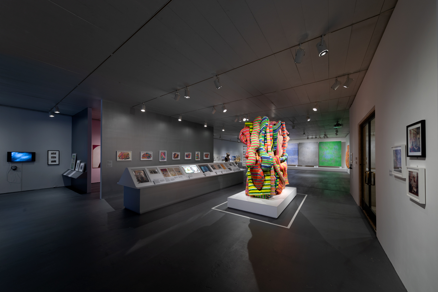
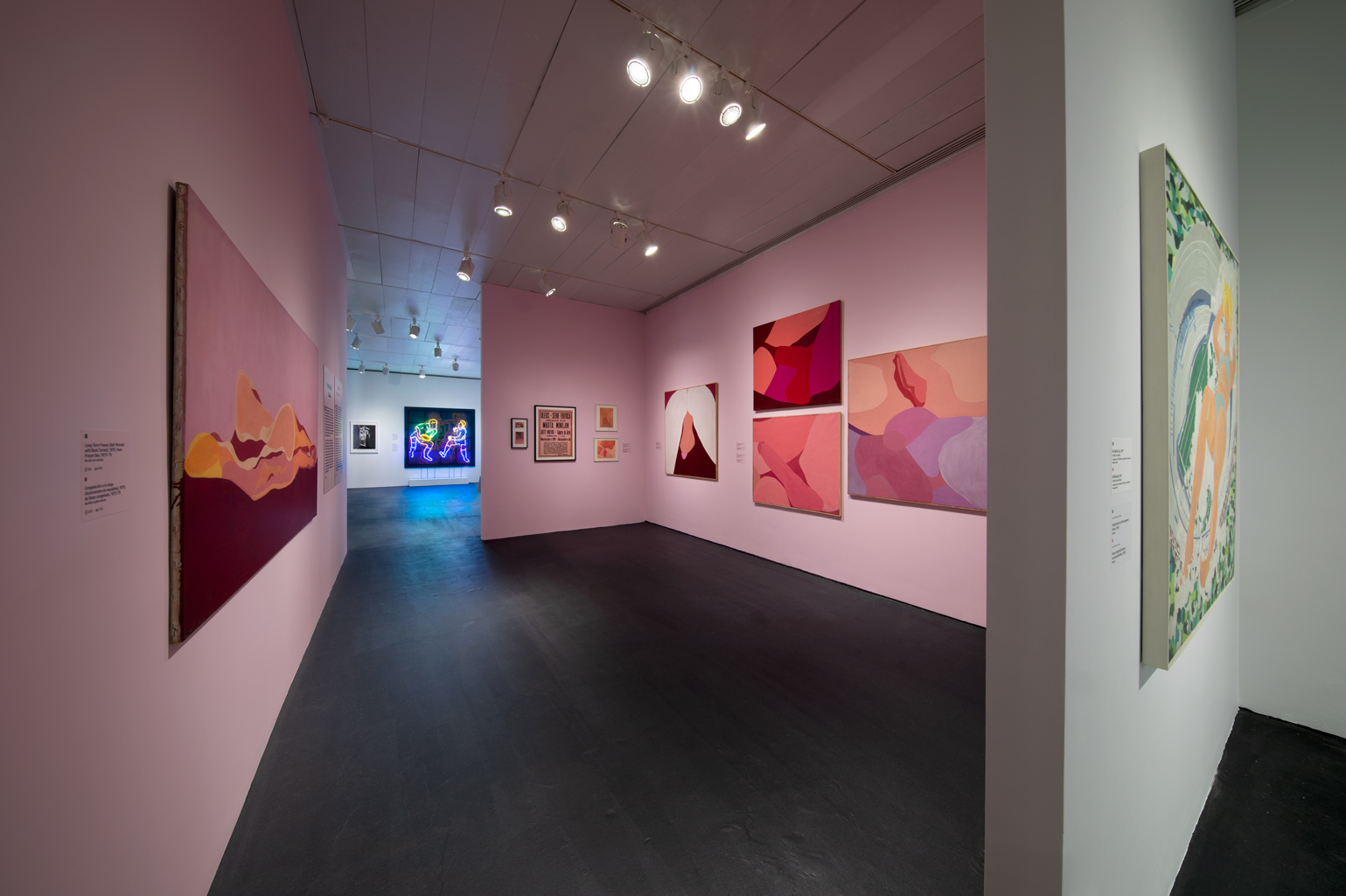
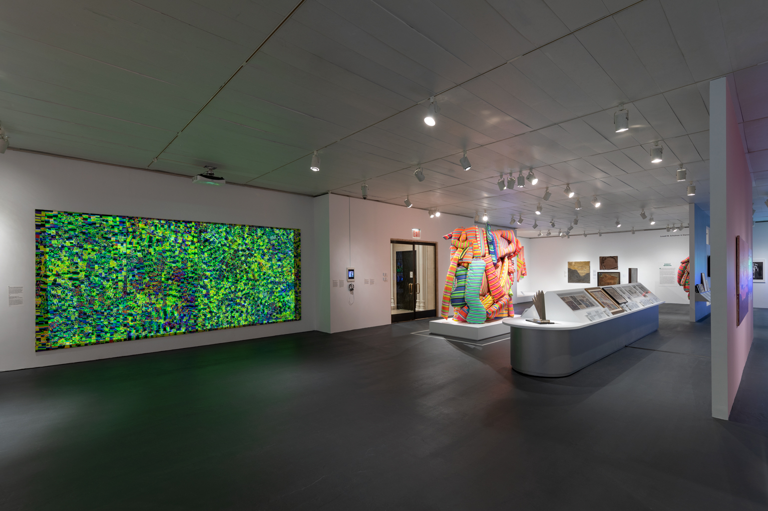
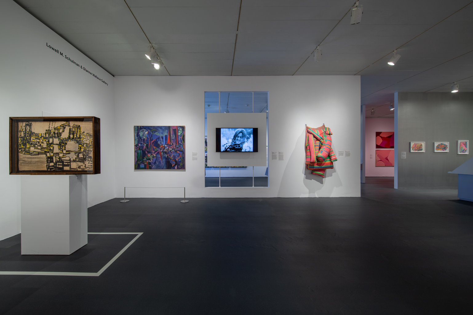
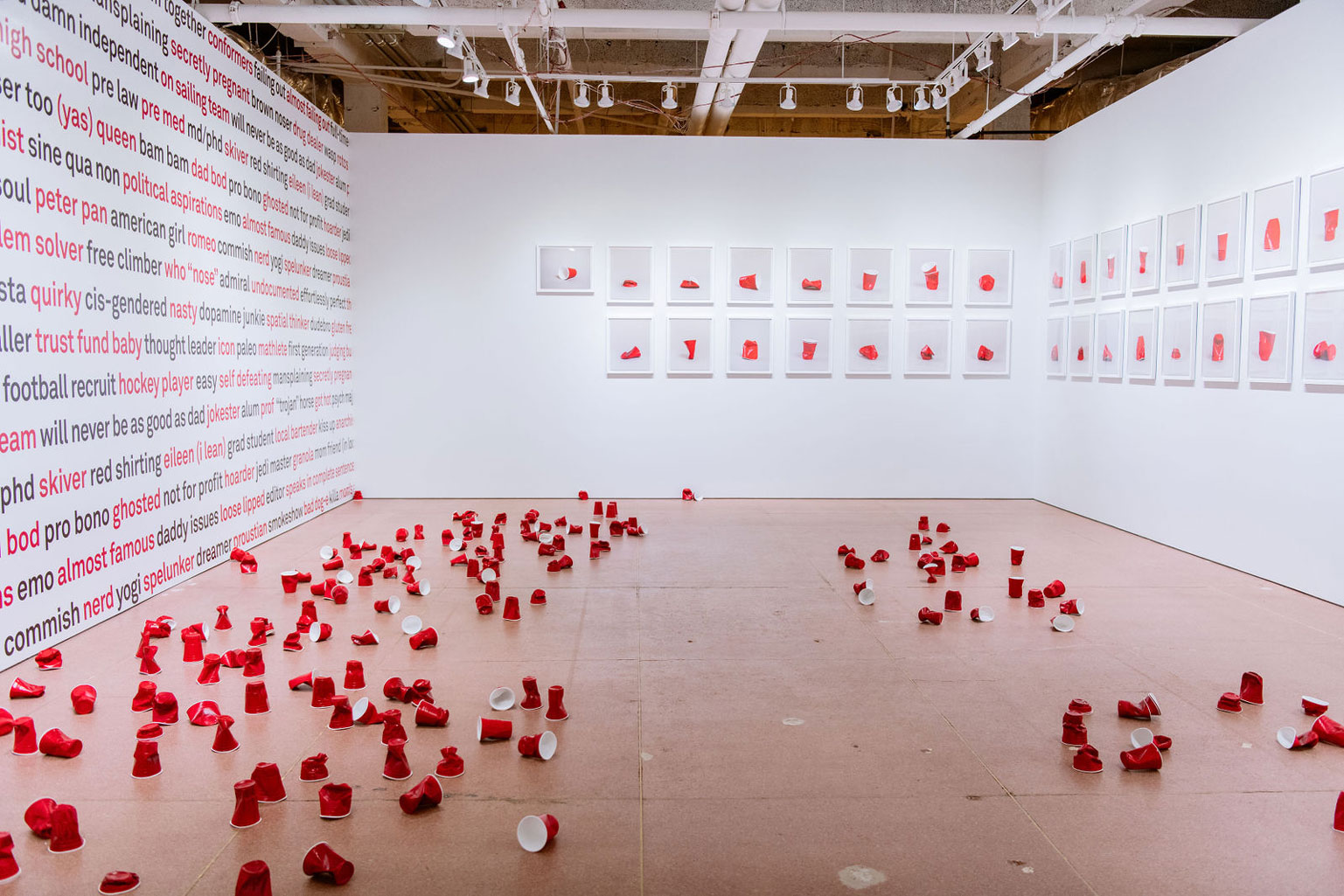
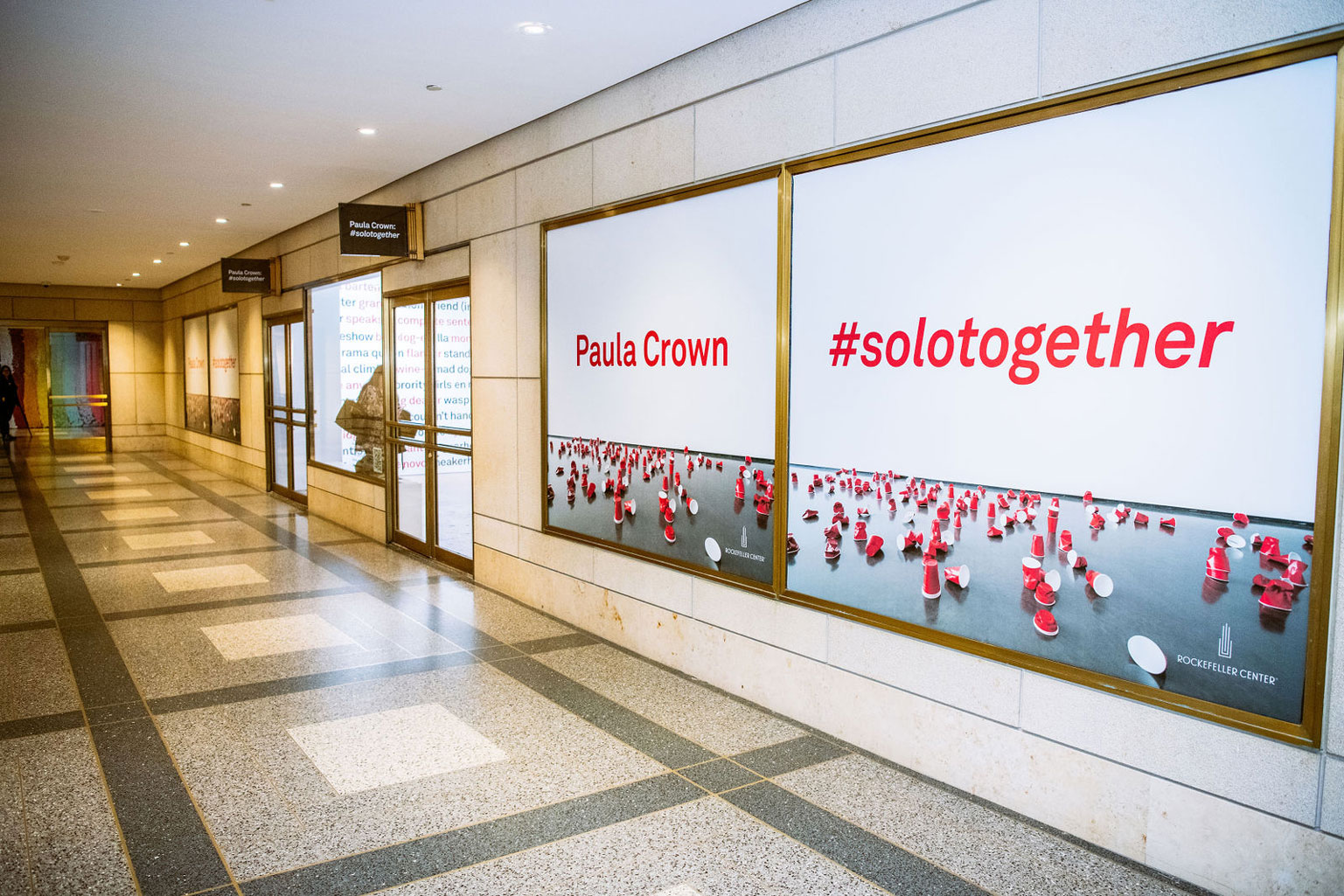
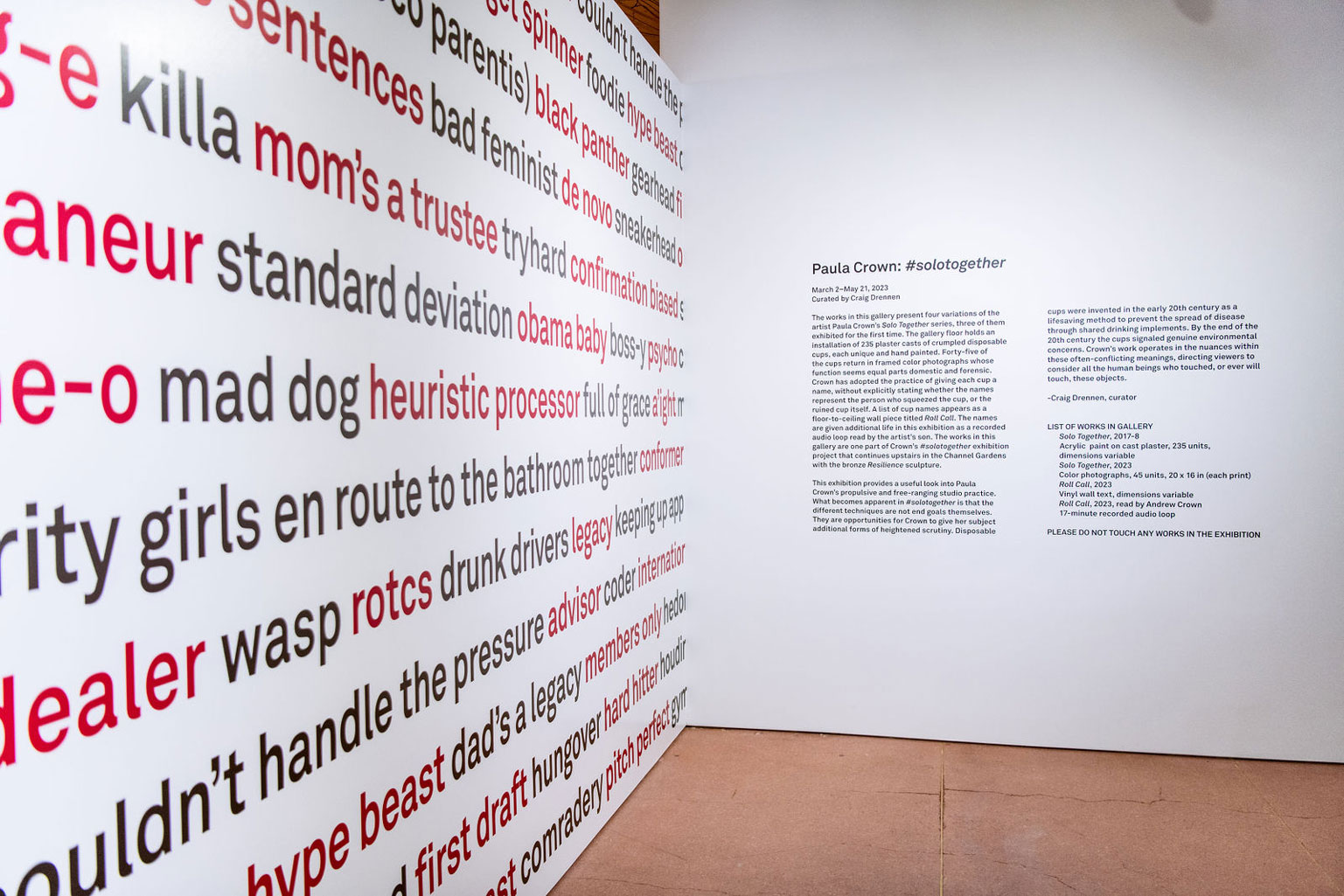
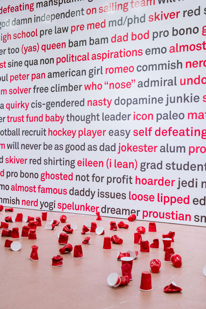
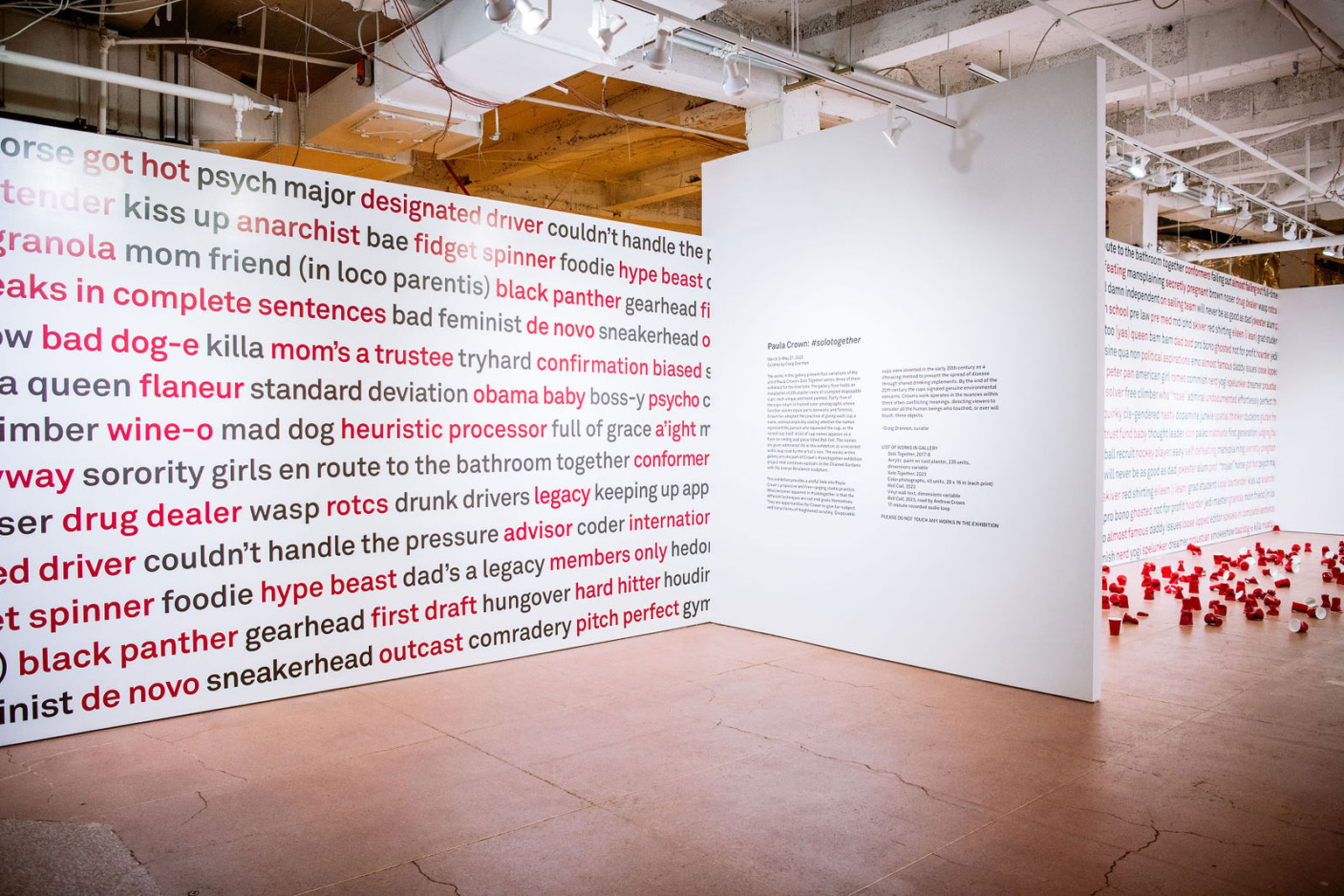
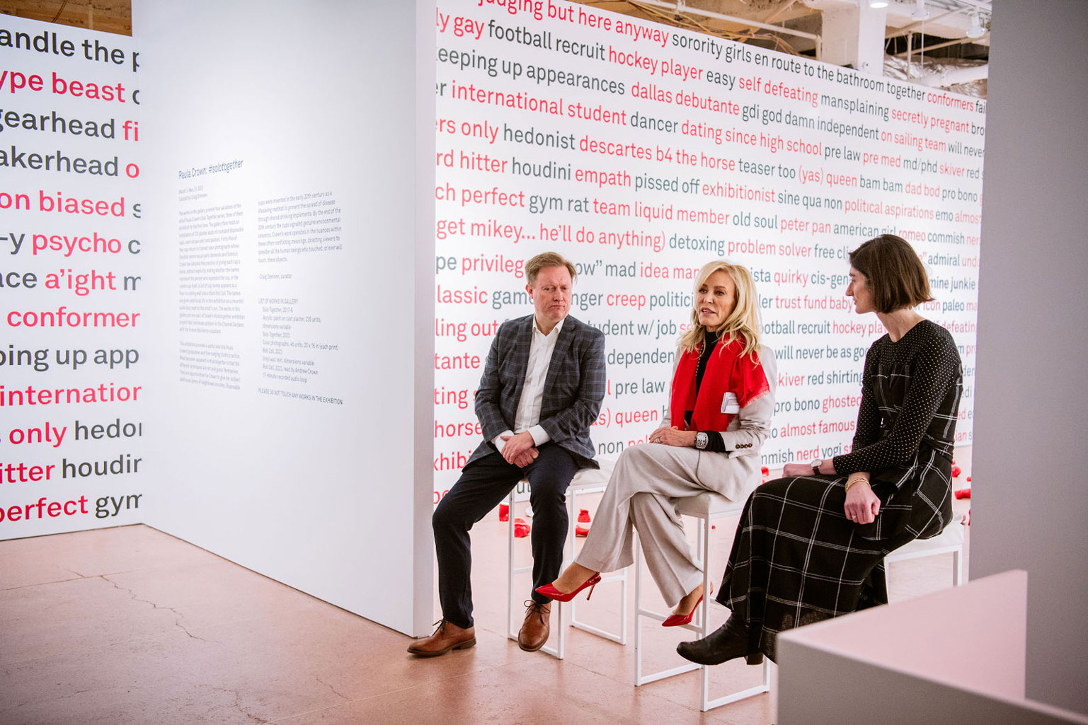
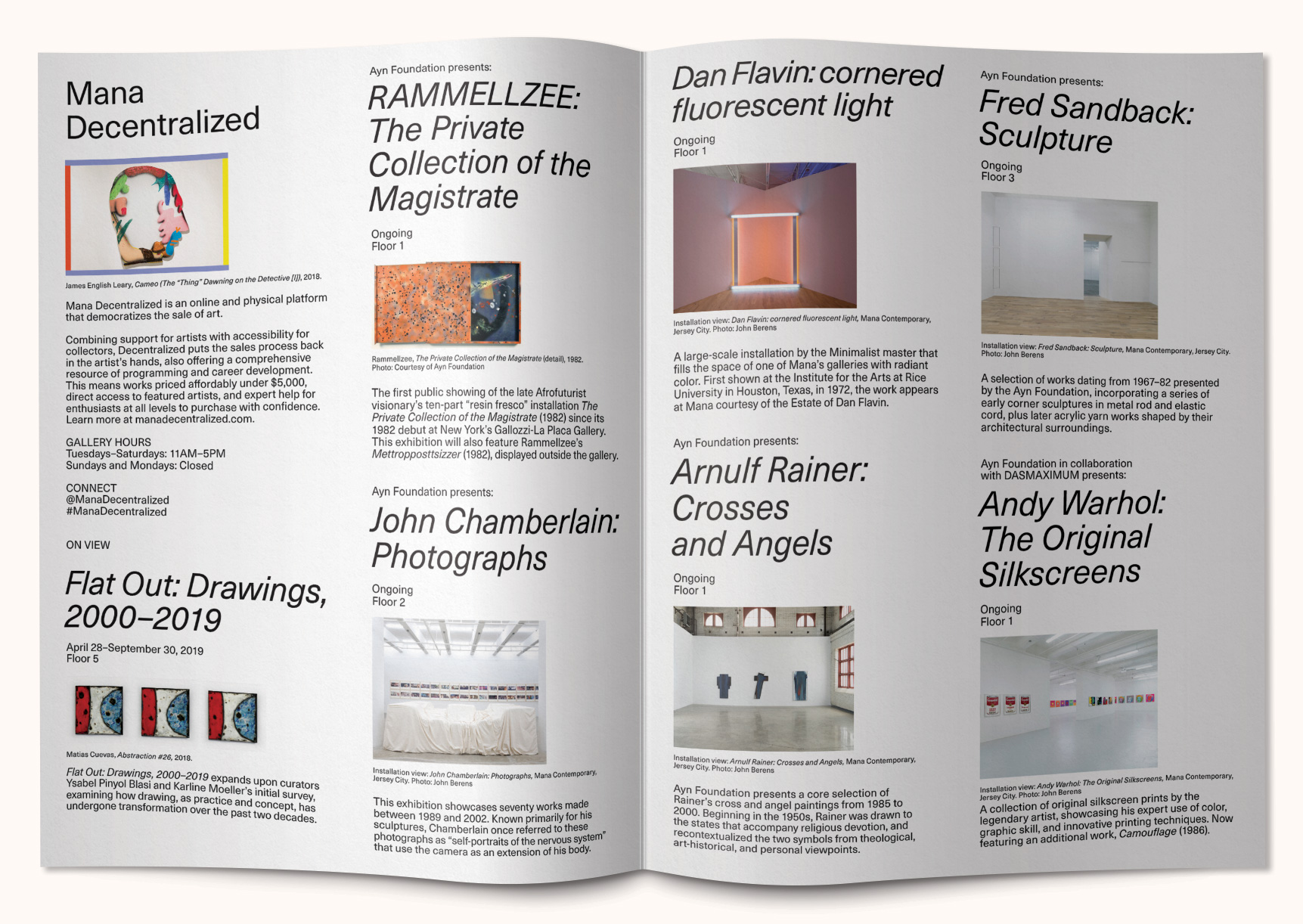
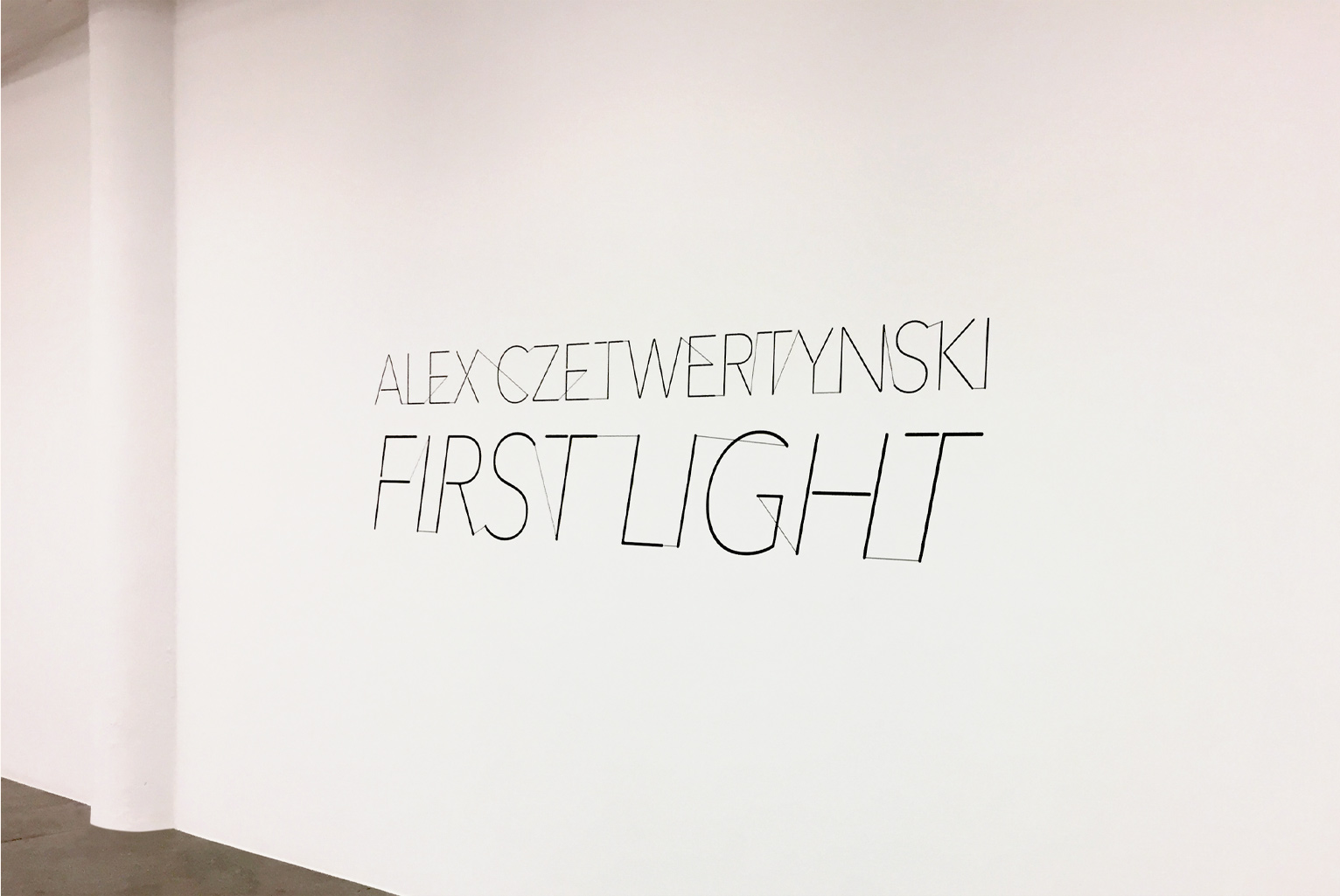
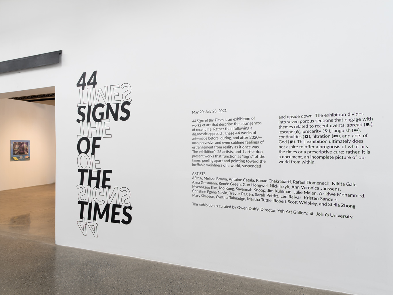
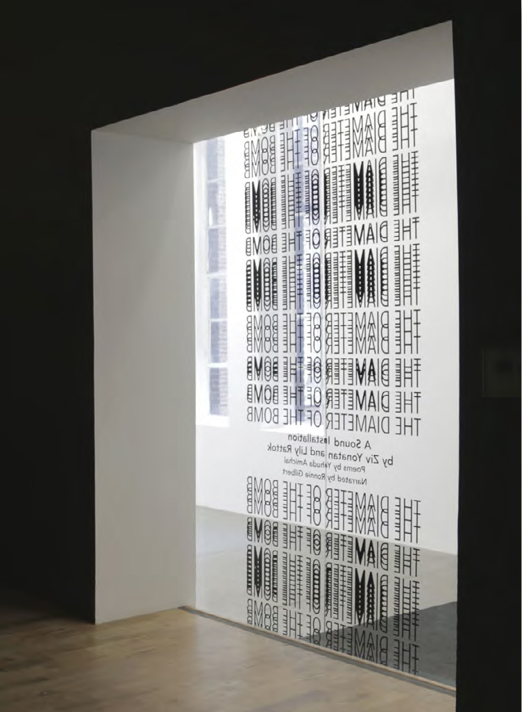
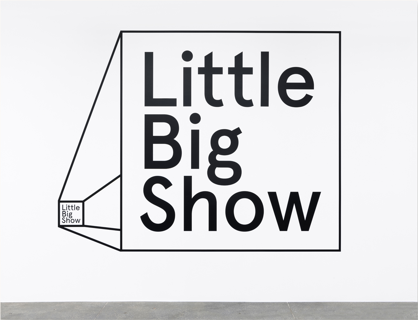
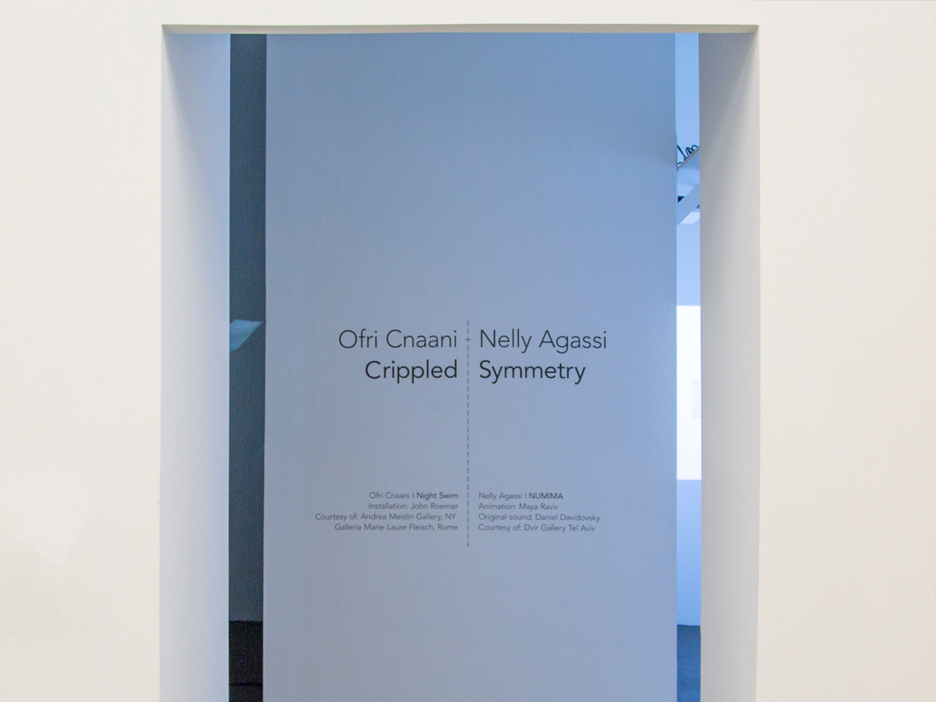
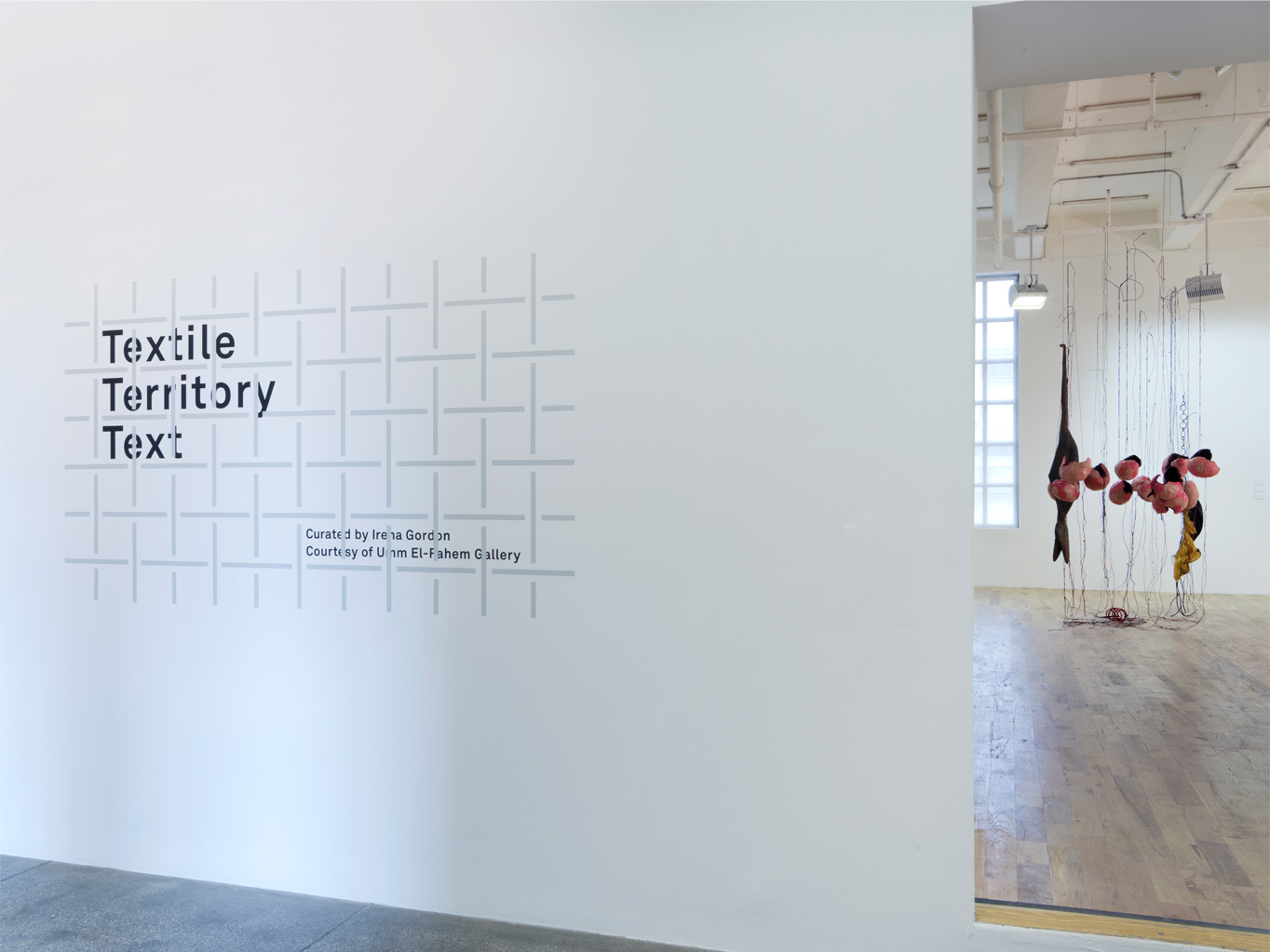
Exhibition Title Designs
A collection of title designs I created for various exhibitions throughout my years at Mana Contemporary.
As a visual identity designer for various exhibitions, my style and process are focused on creating an identity that effectively communicates the exhibition's theme and purpose without detracting from the artwork on display. I collaborate closely with curators and artists to understand the key concepts and ideas behind the exhibition and use this insight to design an identity that is cohesive and compelling, seeking out subtle yet impactful ways to incorporate typography and graphics that bring the exhibition's concept to life.
As a visual identity designer for various exhibitions, my style and process are focused on creating an identity that effectively communicates the exhibition's theme and purpose without detracting from the artwork on display. I collaborate closely with curators and artists to understand the key concepts and ideas behind the exhibition and use this insight to design an identity that is cohesive and compelling, seeking out subtle yet impactful ways to incorporate typography and graphics that bring the exhibition's concept to life.
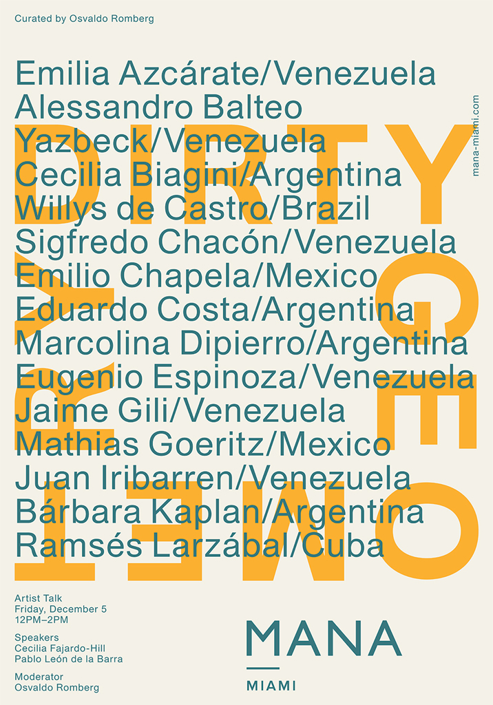
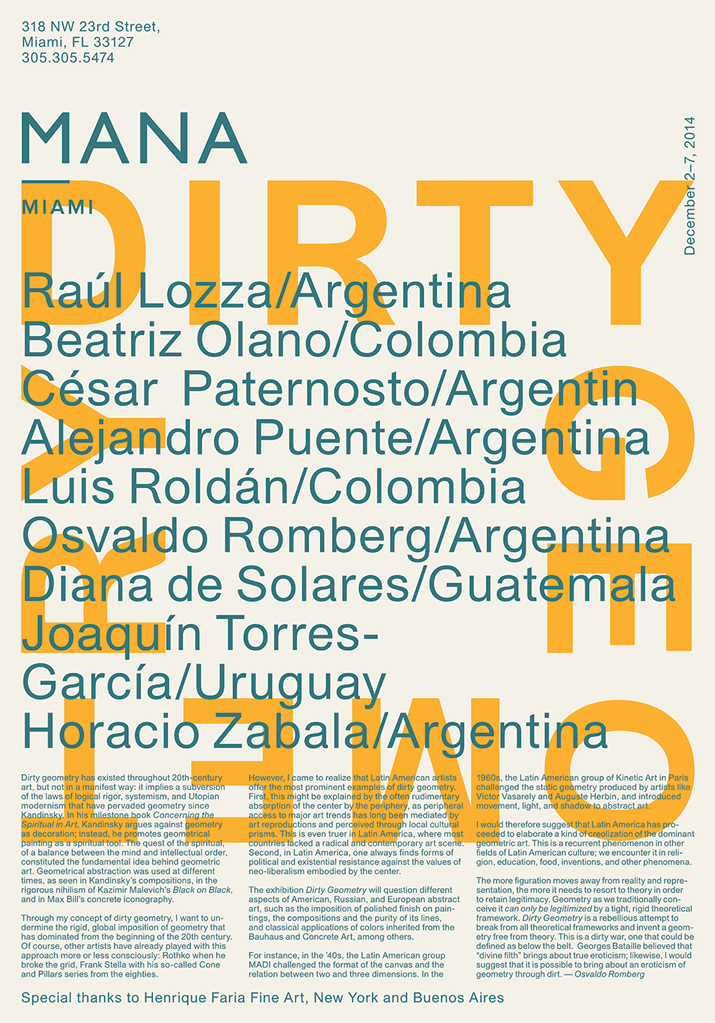
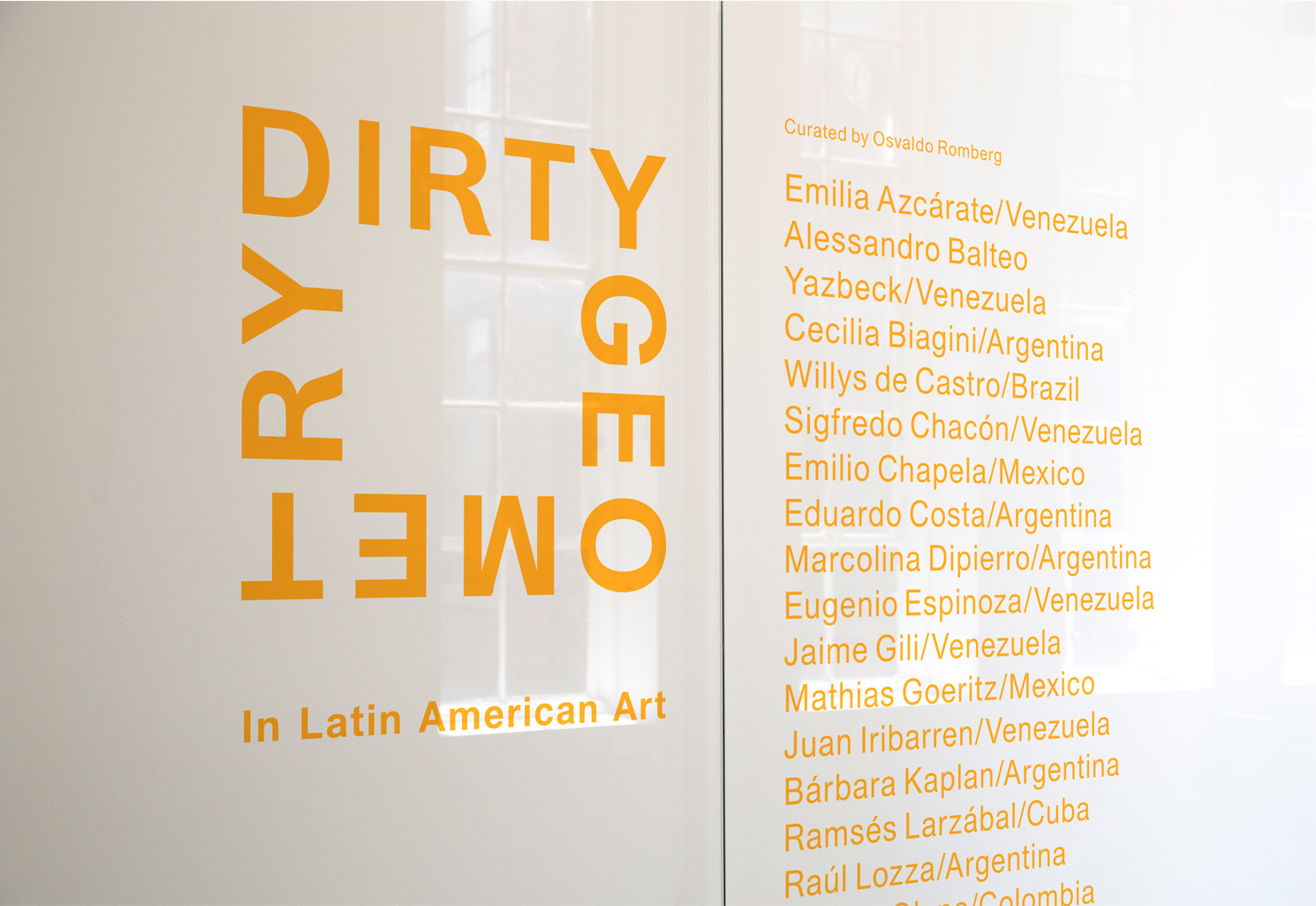
Dirty Geometry – Exhibition Branding
This exhibit presents Latin Americans working in
geometric abstraction dating between 1950 and today.
The visual identity for the Dirty Geometry exhibition at Mana Contemporary was designed to reflect the exhibition's curatorial vision of subverting traditional notions of geometry. Curated by artist Osvaldo Romberg, Dirty Geometry showcased works that pushed against the rigid, theoretical framework of traditional geometry. The exhibition's visual identity reflected this ethos by breaking with traditional notions of layout design.
The visual identity for the Dirty Geometry exhibition at Mana Contemporary was designed to reflect the exhibition's curatorial vision of subverting traditional notions of geometry. Curated by artist Osvaldo Romberg, Dirty Geometry showcased works that pushed against the rigid, theoretical framework of traditional geometry. The exhibition's visual identity reflected this ethos by breaking with traditional notions of layout design.
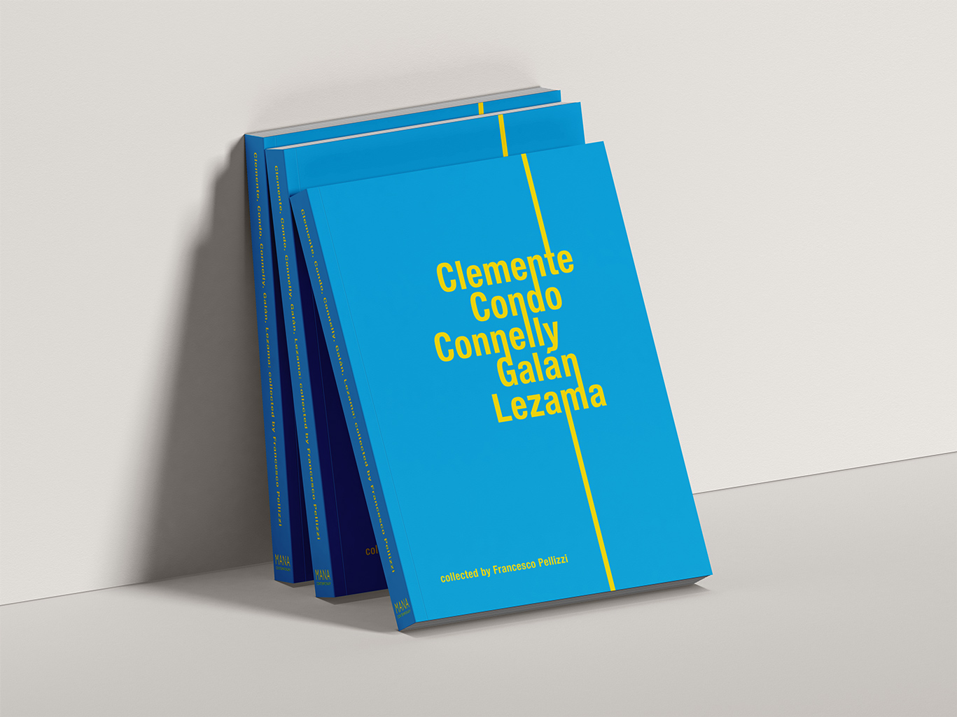
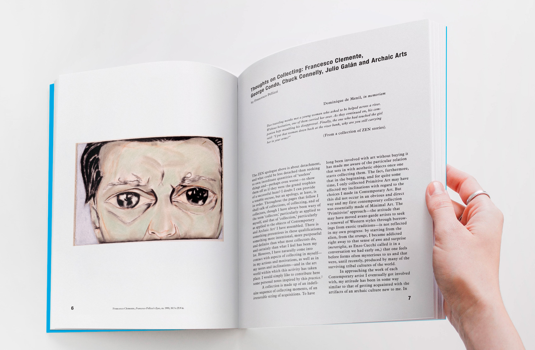
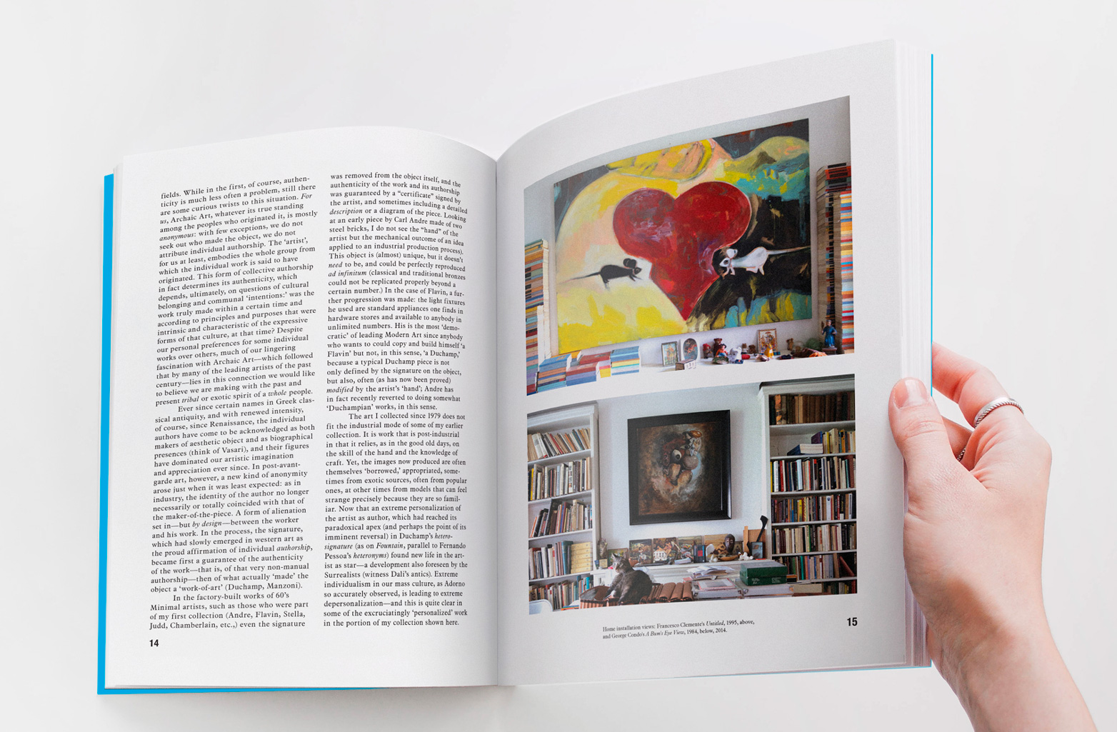
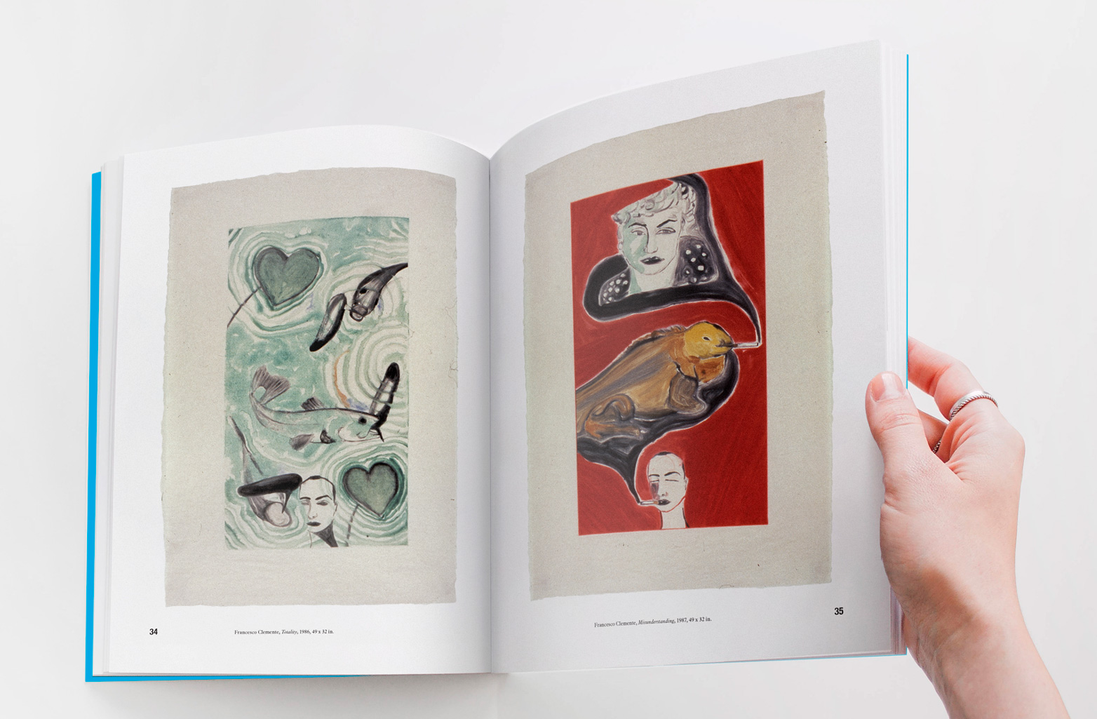
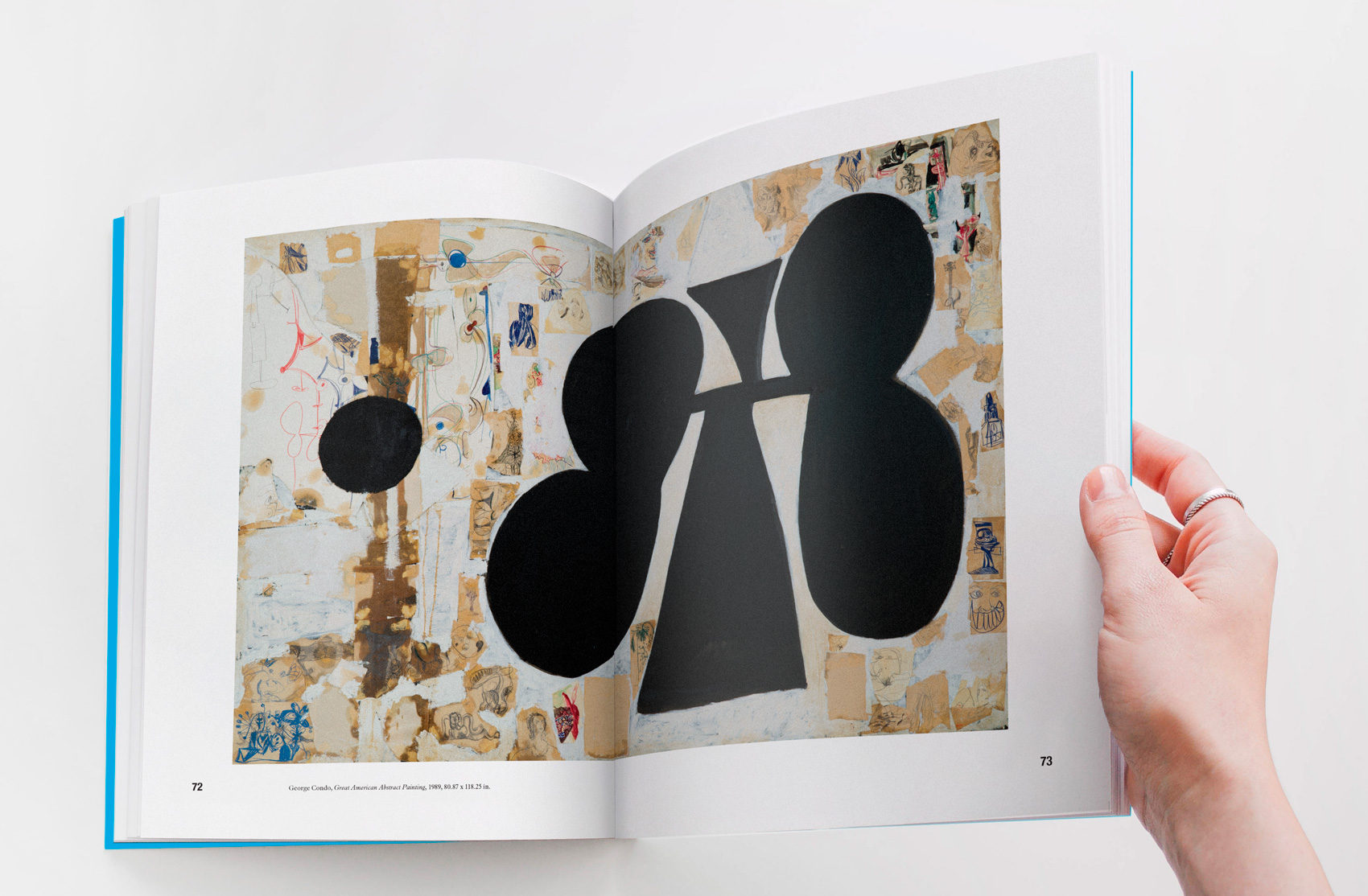
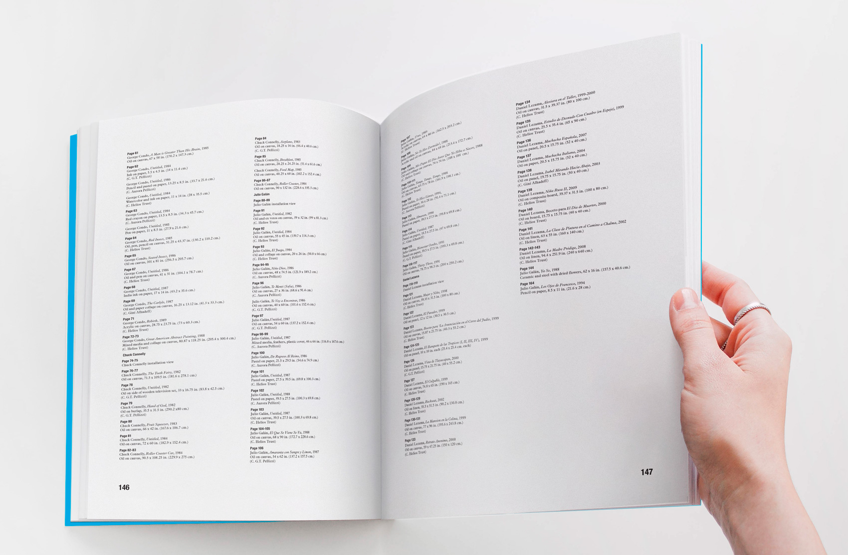
Clemente, Condo, Connelly, Galán,
and Lezama in the Pellizzi Family Collections – Exhibition Catalogue
This exhibit catalog showcases highlights from
the Pellizzi Family Collections, an impressive selection of works by some of the most renowned artists of the late 20th century.
As the designer and production manager for this catalog, I collaborated closely with Francesco Pellizzi and his team to bring their vision to life. It showcases highlights from the Pellizzi Family Collections, featuring works by Chuck Connelly, Francesco Clemente, George Condo, Julio Galán and Daniel Lezama. The exhibition's themes span mysticism, mythology, history, and romanticism, echoing the diverse nature of Pellizzi's collection.
As the designer and production manager for this catalog, I collaborated closely with Francesco Pellizzi and his team to bring their vision to life. It showcases highlights from the Pellizzi Family Collections, featuring works by Chuck Connelly, Francesco Clemente, George Condo, Julio Galán and Daniel Lezama. The exhibition's themes span mysticism, mythology, history, and romanticism, echoing the diverse nature of Pellizzi's collection.